Client:
Fundația9
Sector:
Culture, Institutional
Year:
2024
Type:
Branding
Design
Poster
Strategy
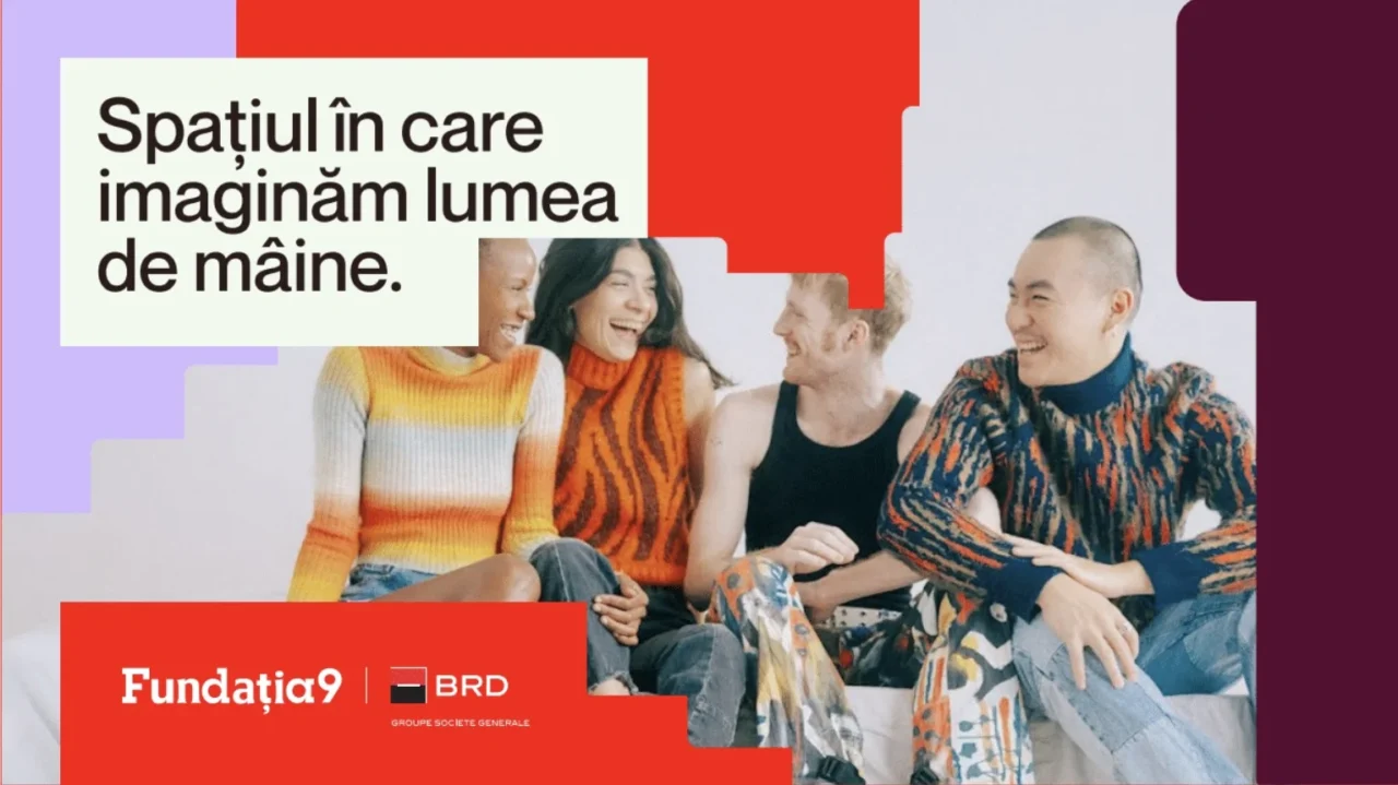
Rebranding one cultural platform is one thing. Rebranding an entire ecosystem is another. For Fundația9, the challenge was never just to refresh a visual identity. It was to build a brand architecture capable of holding together a larger cultural universe: Scena9, Școala9, and Rezidența9. Different audiences. Different formats. Different types of work. One parent brand behind all of them. So we did not approach this as four separate redesigns. We started with the structure, built the system from the top down, and made sure the parent identity could gather the others without flattening them.
A Solid Brand Architecture: Starting With the Parent Brand
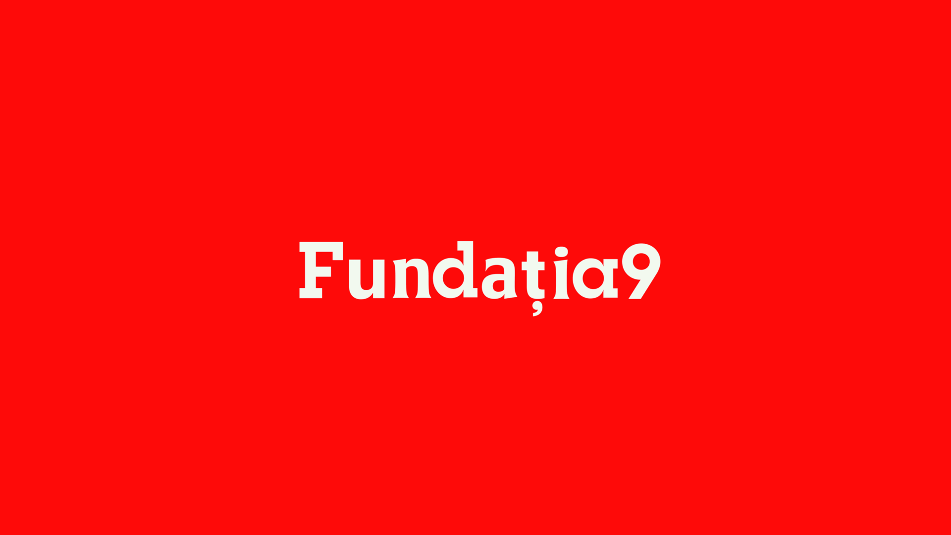
Some identity systems start with the children. This one had to start with the parent.We began with Fundația9, the brand that gathers and powers Scena9, Școala9, and Rezidența9. Initiated and funded by BRD, it sits behind a larger cultural ecosystem built on one simple belief: culture matters more when more people have access to it. That changed the nature of the job immediately.
We were not refreshing four logos in parallel. We were building one brand architecture strong enough to hold different platforms, audiences, and forms of cultural work inside a single, legible system.
The Glitch
We defined the role before the look
Before anything else, we had to define what the parent brand was there to do.
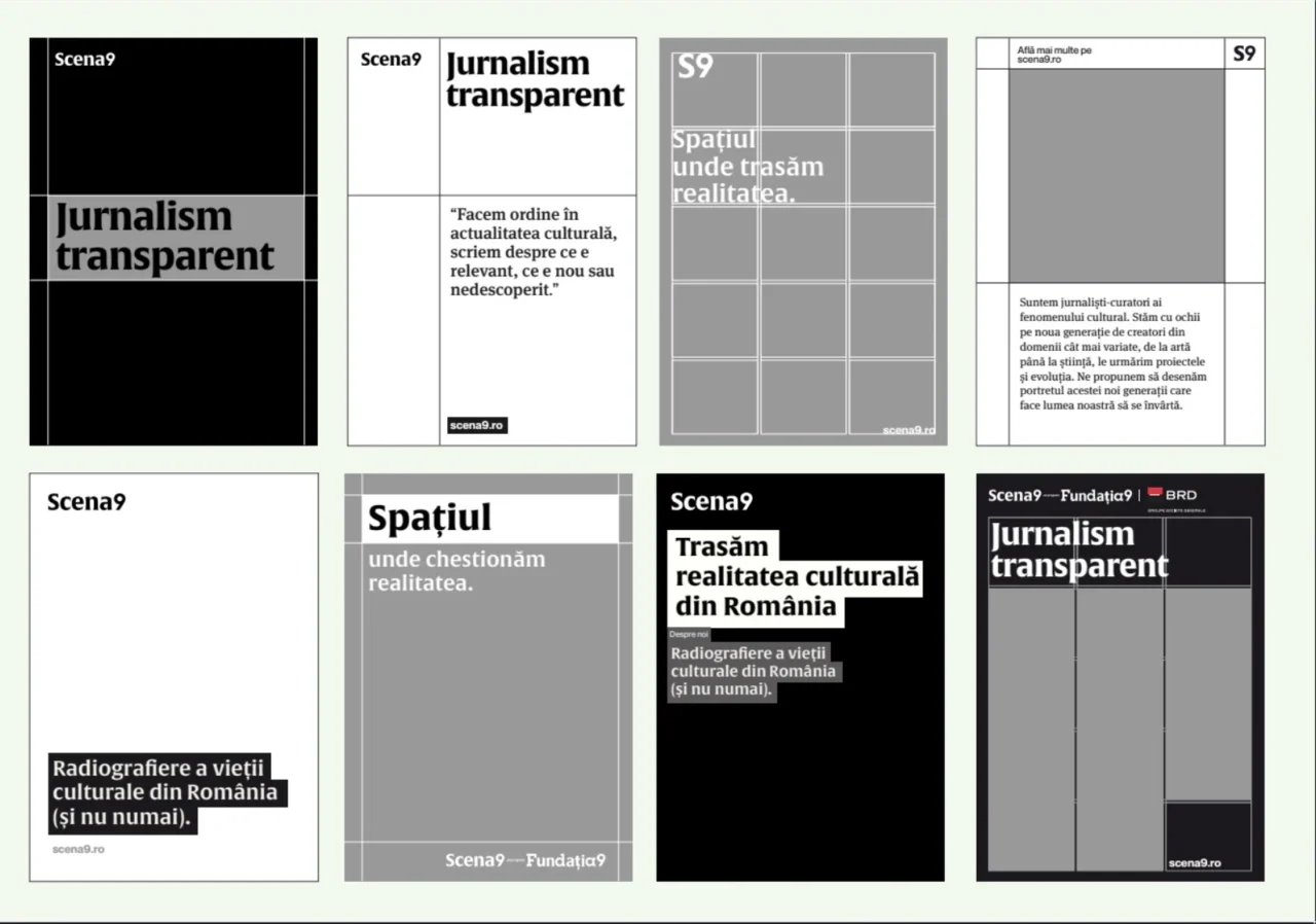
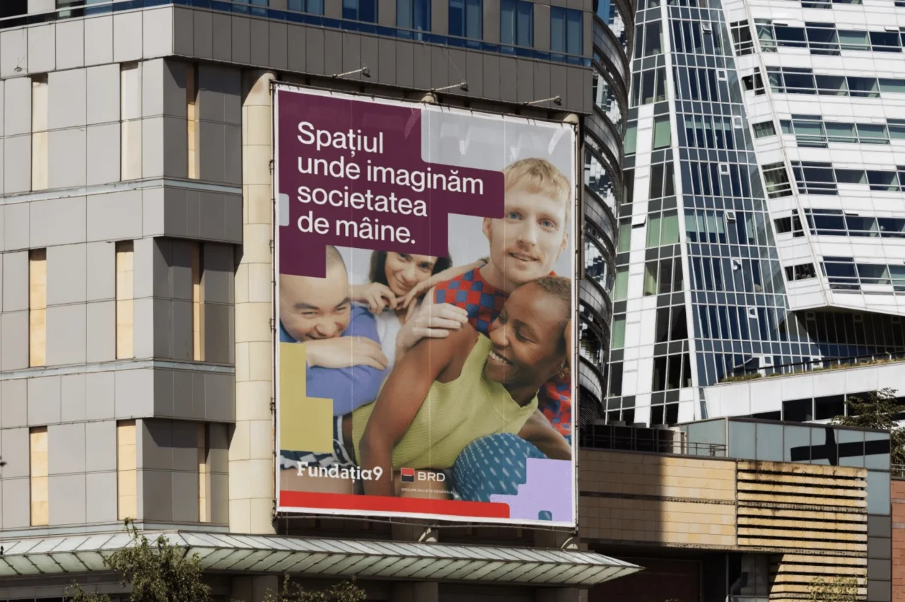
Fundația9 could not behave like a loud umbrella flattening everything beneath it. We decided it had to do something harder and more useful. It had to gather, align, and create room. The strategic idea behind it is generous by design: Fundația9 champions inner diversity and quietly handles what the presentation calls “the logistics of possibility.” So we built the parent identity as a stabilizing layer. Clear, neutral, structural. Present enough to hold the system together, restrained enough to let the others speak in their own way.
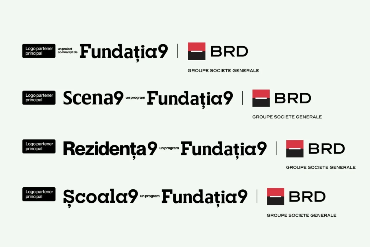
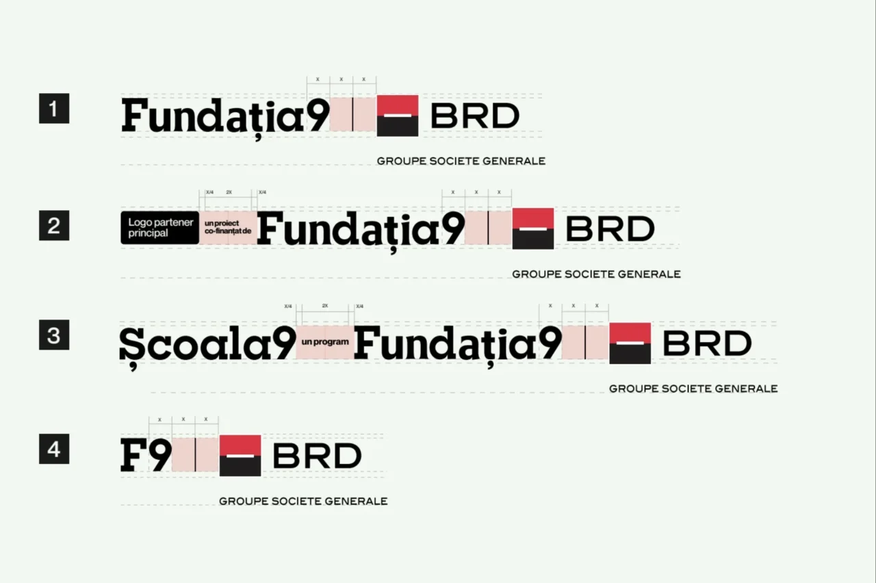
That logic shaped the visual architecture too. We designed Fundația9 to stitch together the identities of the three sub-brands, with the number 9 as the shared constant across all logos. We kept the masterbrand typography deliberately neutral, more conductor than soloist, so the system could stay coherent, support collaborations, and expand over time without losing its logic.
Then we built the family resemblance
Once the parent brand had the right role, the real challenge was coexistence.
Too much consistency and everything starts feeling interchangeable. Too much independence and the parent disappears. We needed a middle path. So we built a system that creates recognition through structure, not through forced sameness. Shared rules. Shared alignment. Shared logic. Enough consistency to make the family visible, enough freedom to let each brand stay fully itself.
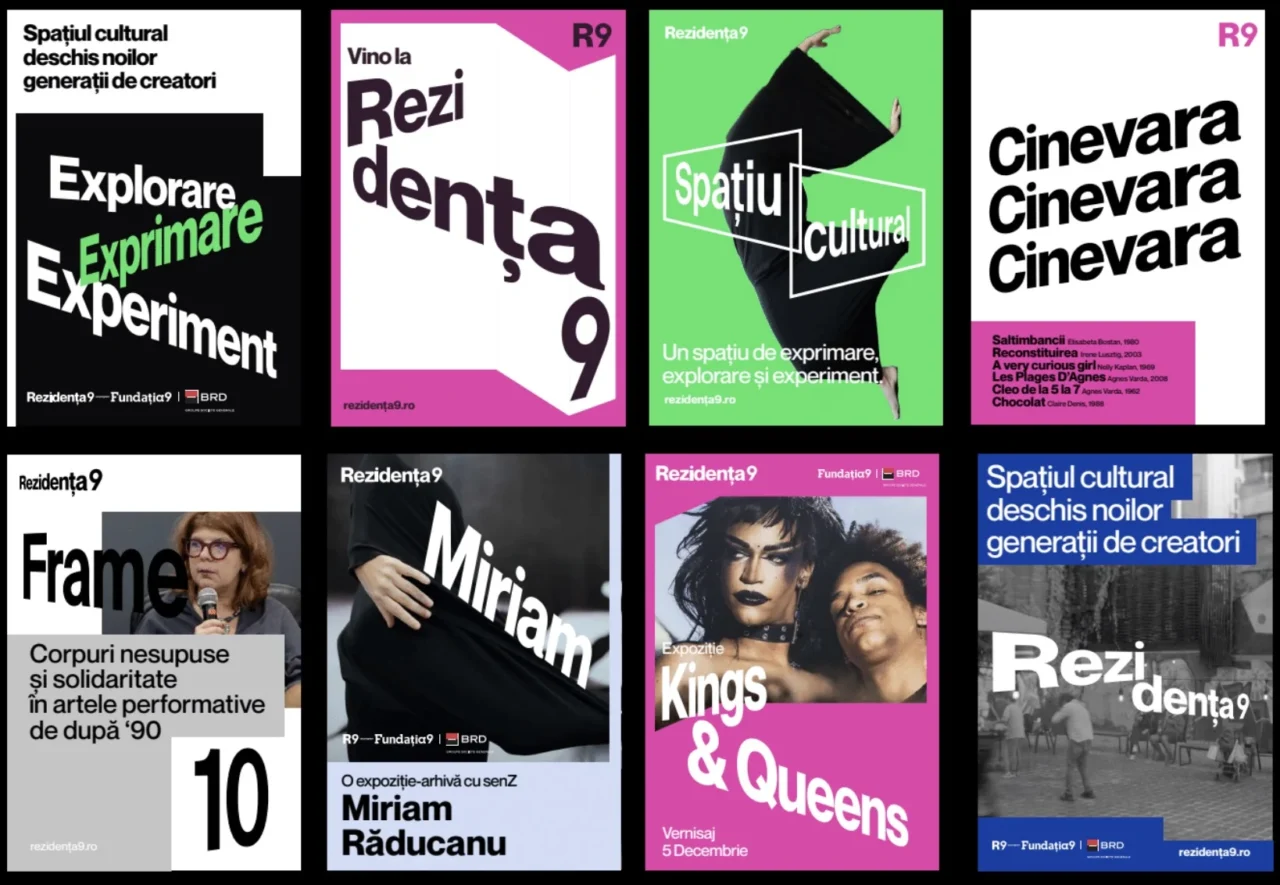
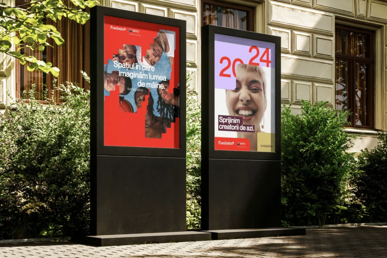
That meant developing a co-branding architecture that could govern everything from joint event posters to digital interfaces and crossover initiatives. We wanted the system to work not just when the brands appear alone, but especially when they appear together. The presentation describes it as a modular score: distinct movements, one unmistakable symphony. That is exactly what we were after. We built the tempo into the system, then let each identity play its part.
Only then did we sharpen the sub-brands
With the architecture in place, we could make each identity more fully itself.
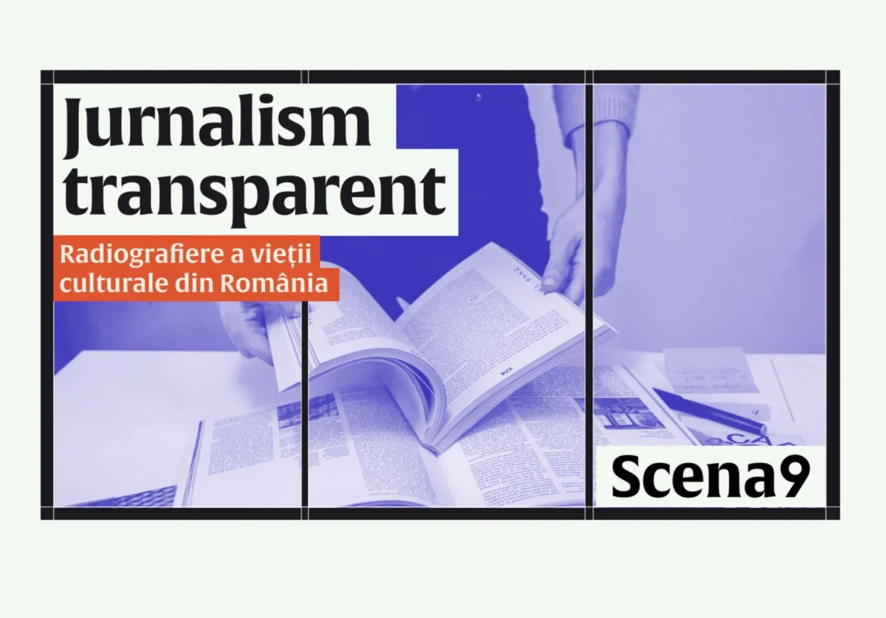
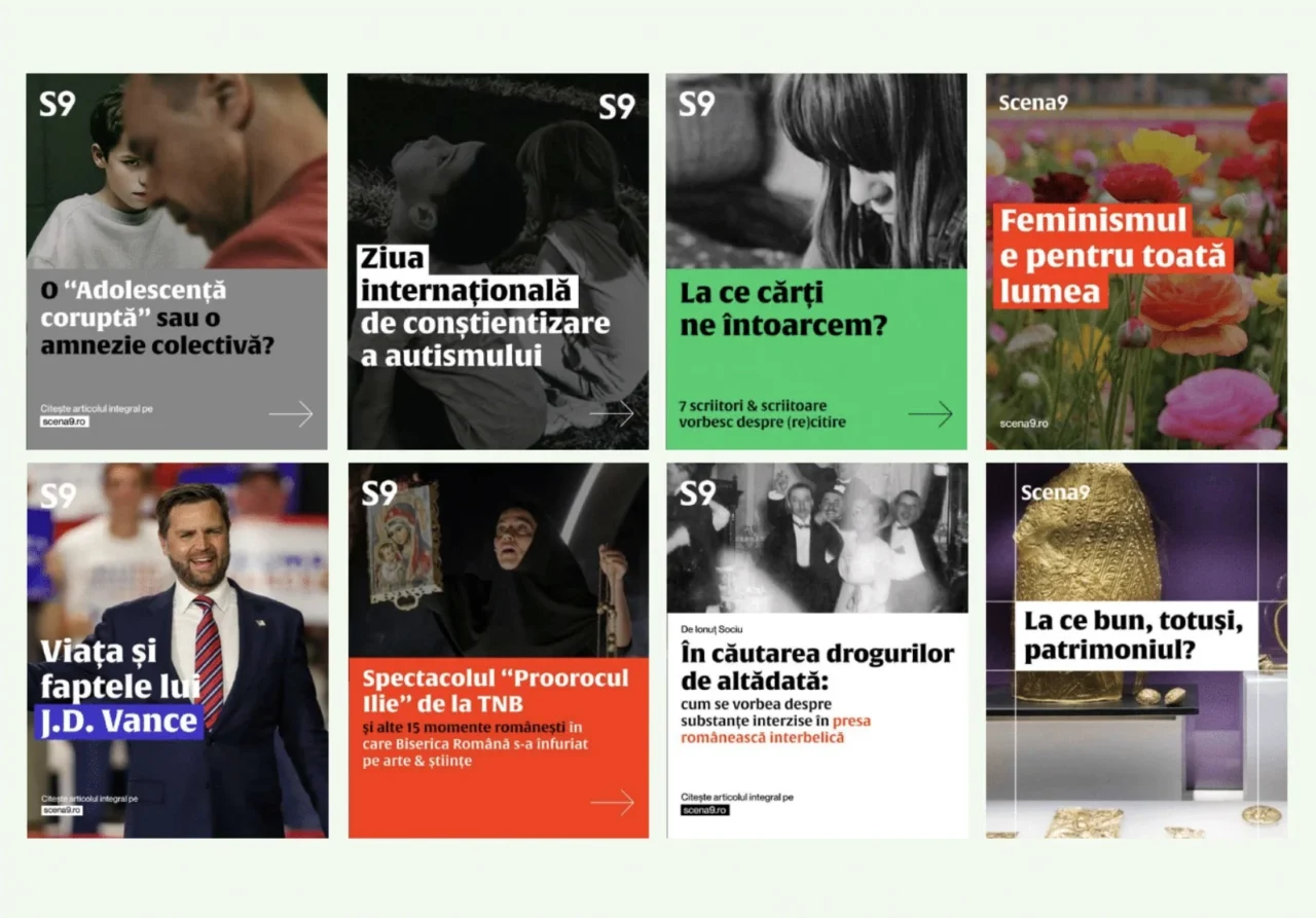
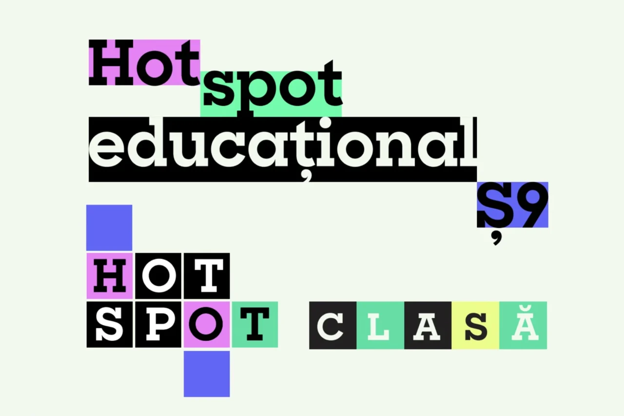
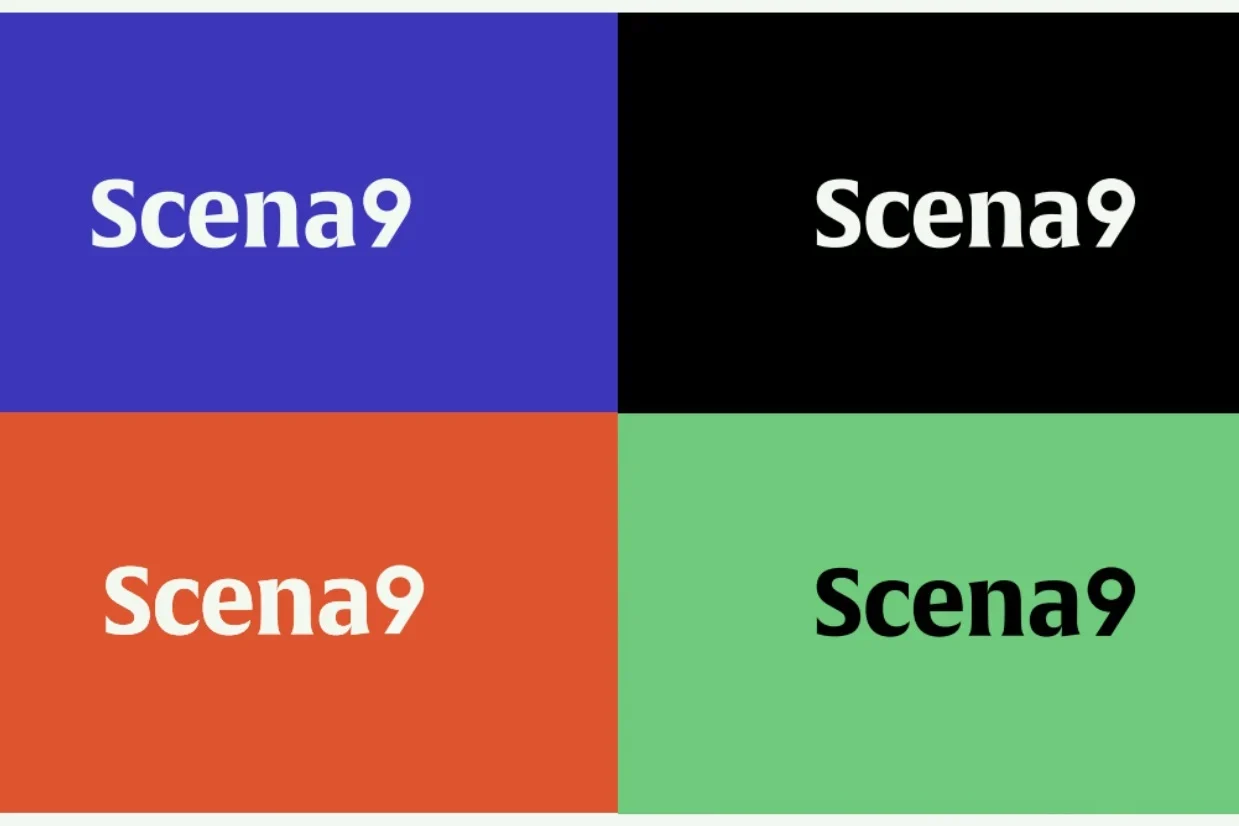
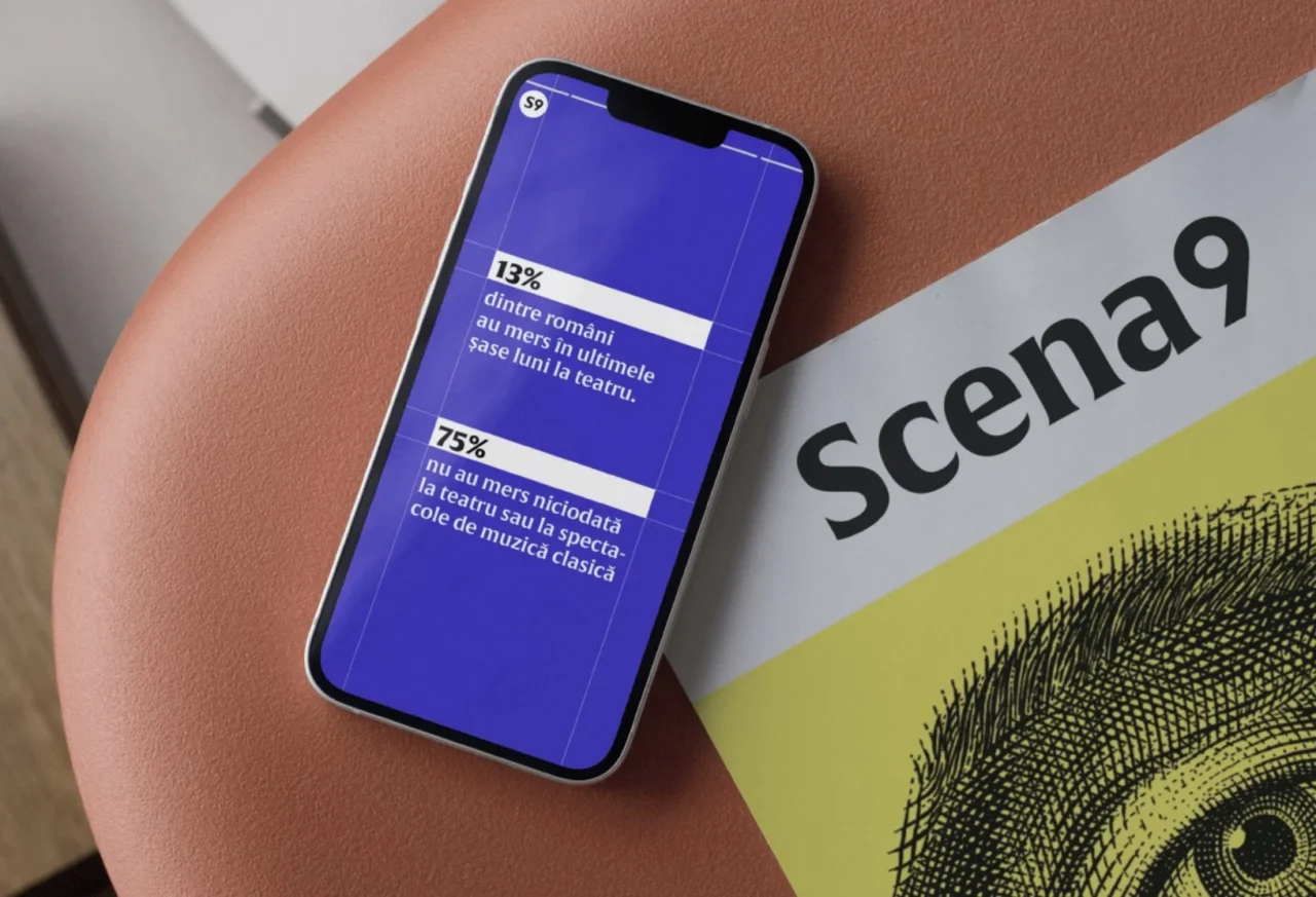
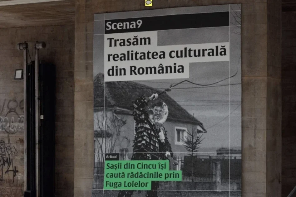
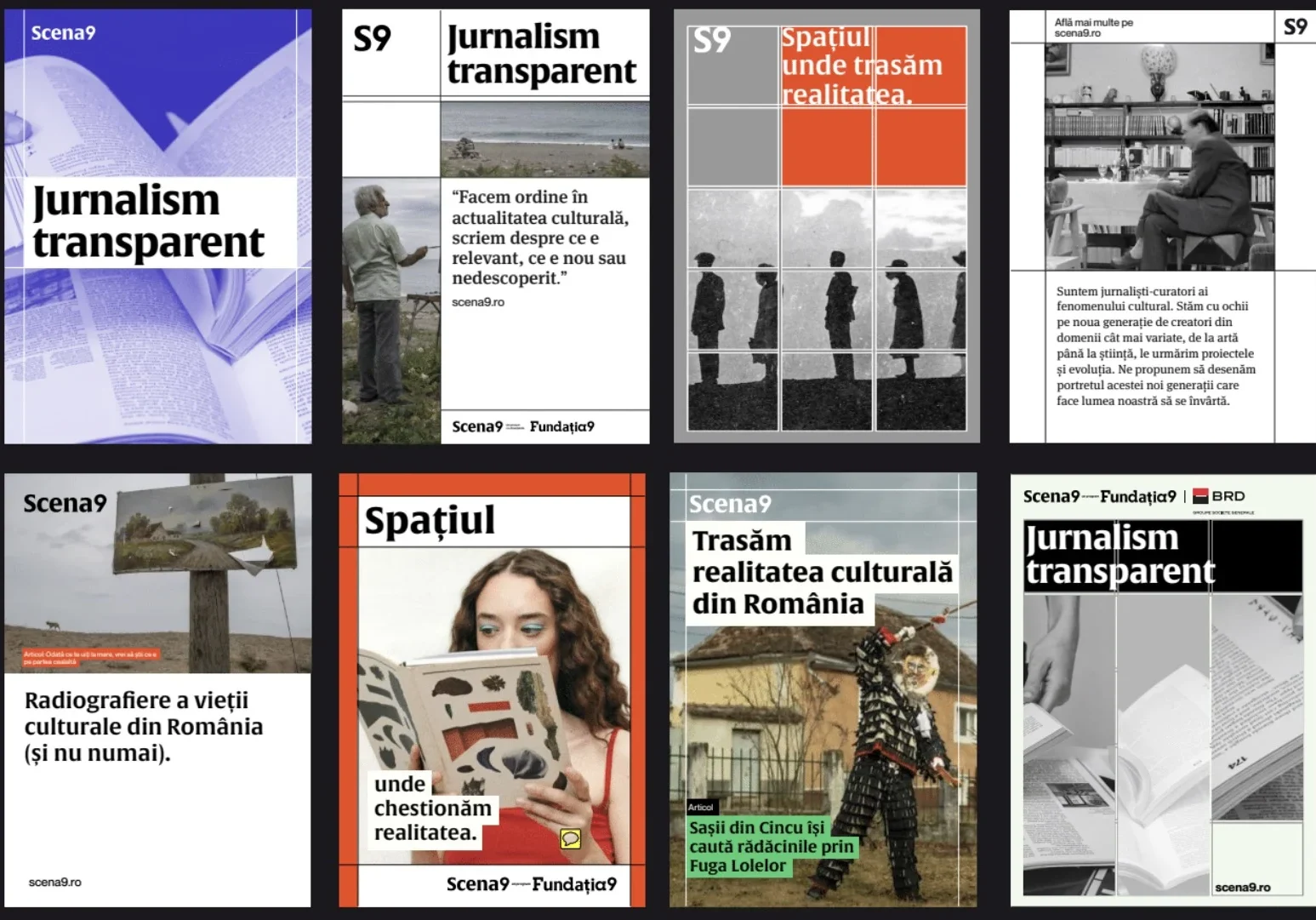
For Scena9, we leaned into the editorial core. We took the publishing grid and pulled it into plain sight. Columns, gutters, baselines, empty squares. What usually sits in the background became the identity itself. The result is a sharper, more ownable visual language for a journalism platform that wants to investigate, interpret, and stay culturally alert.
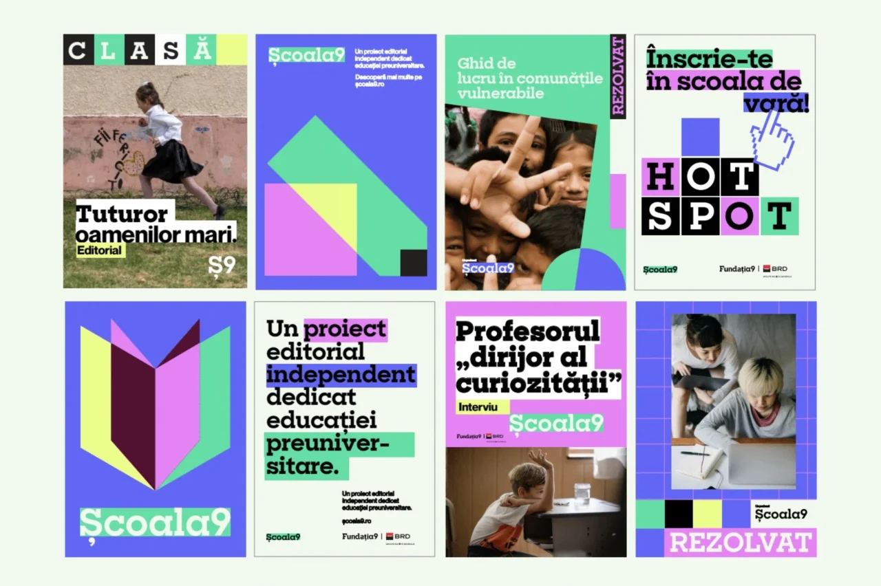
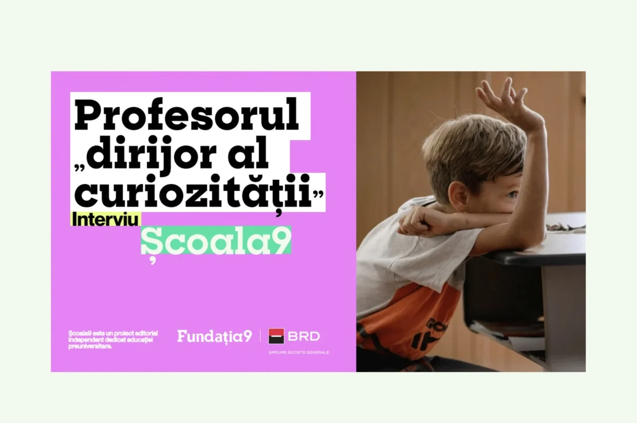
For Școala9, we made a different decision. Here the system had to feel more modular, constructive, and open. So we built the identity around semi-transparent colored squares and a highlighting gesture, turning the visual language into a set of building blocks. Still part of the same universe, but clearly speaking in an educational register. Brighter, more playful, more visibly about assembling knowledge.
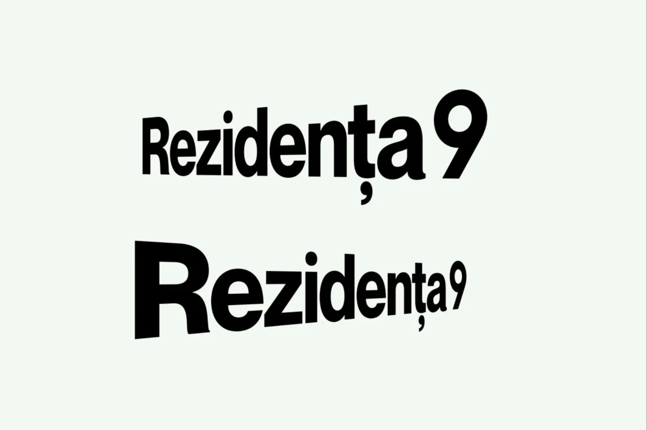
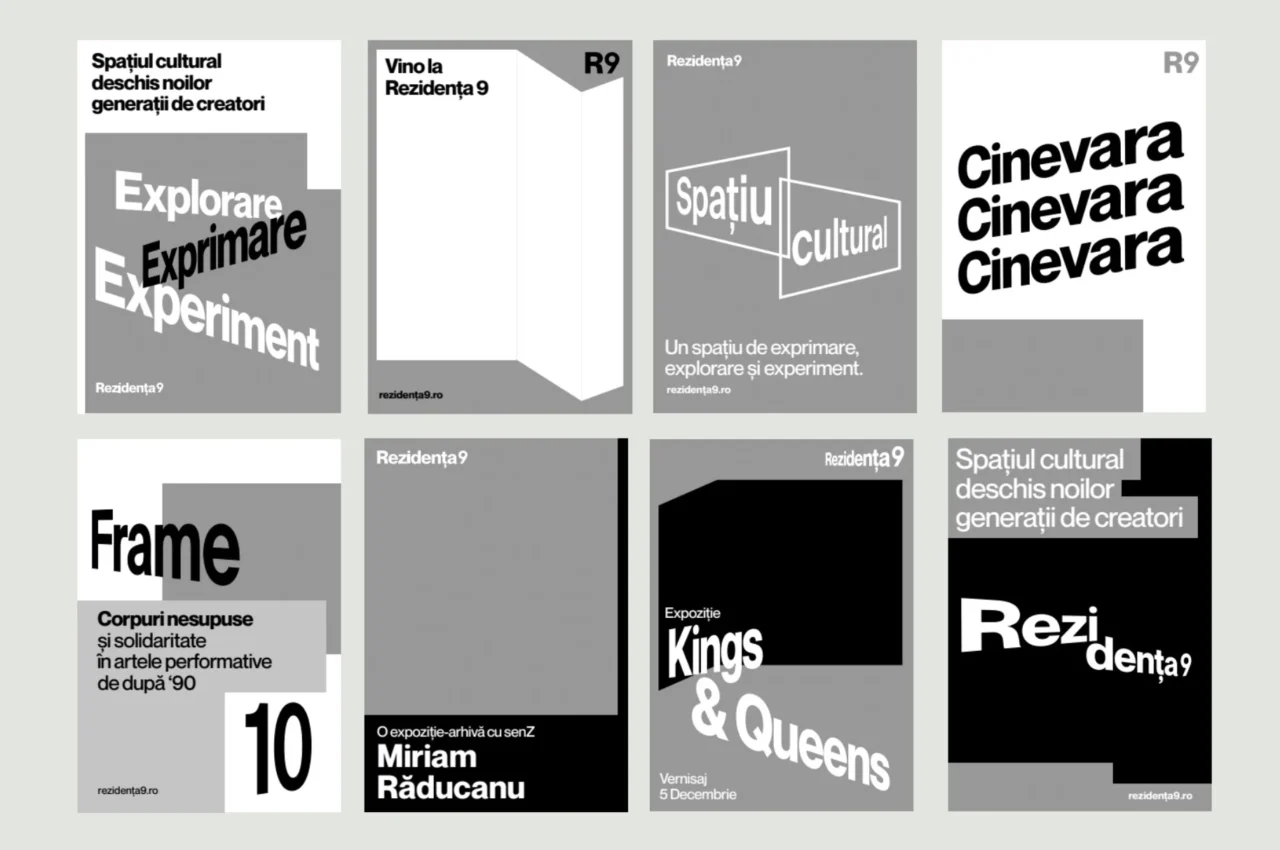
For Rezidența9, we went spatial. Because the brand is tied to a real cultural house, the identity had to think in depth, not just on surface. So we built a language of perspective, extrusion, and angular framing that makes the whole system feel architectural, immersive, and rooted in place.
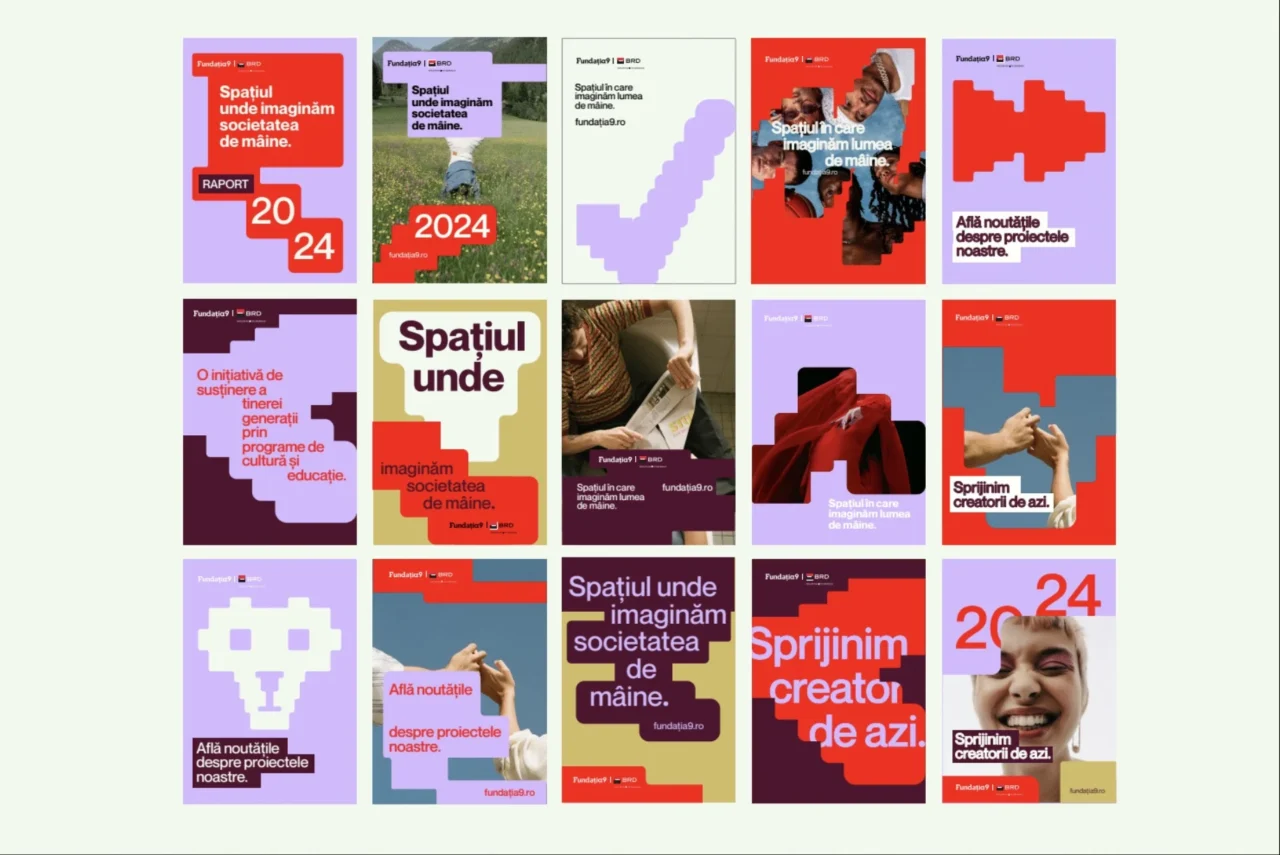
What we actually built
What holds the whole thing together is that the shared DNA is structural, not cosmetic. We kept the 9 constant across the family. We used Fundația9 as the neutral typographic base. We built one alignment logic for co-branding, partnerships, and future extensions.
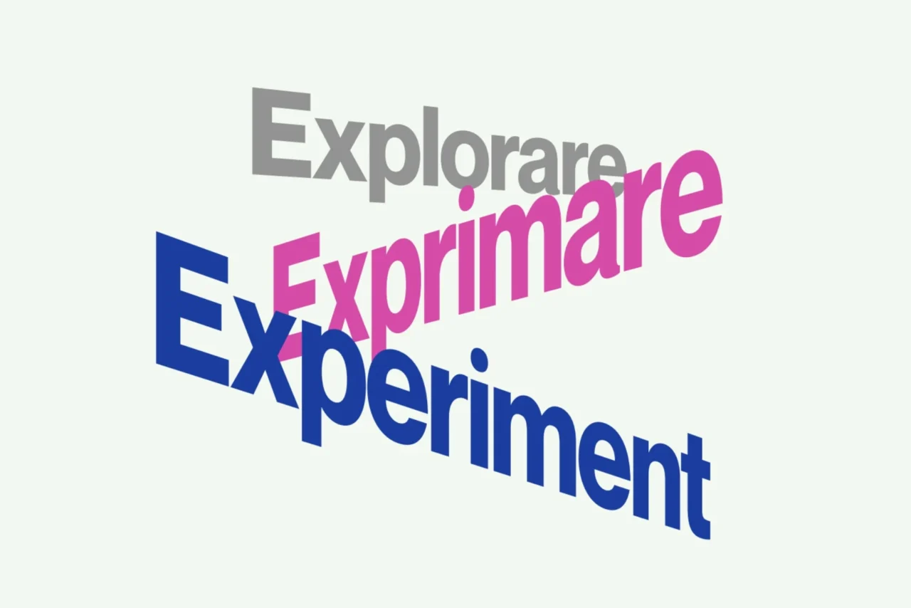
And we grounded the whole system in a clear strategic platform shaped by four shared pillars: Courage, Experimentation, Social Responsibility, and Trust & Quality.
That is the difference between a family of brands and a pile of projects. One has a reason to belong together.
The result
In the end, we did not just give four cultural entities better identities. We gave one ecosystem a clearer operating system.
Fundația9 now reads as the parent brand that powers and connects the others. Scena9 feels sharper. Școala9 feels more modular and open. Rezidența9 feels more spatial and immersive. And when they appear together, they no longer look like adjacent initiatives that happen to share a number.
They look like what they are: distinct voices inside one coherent cultural infrastructure.
That was the point of the rebrand. Not to make four things look better in isolation. To make one system work better, together. See more about Fundația9 and explore our other purpose-driven projects at Glitch.