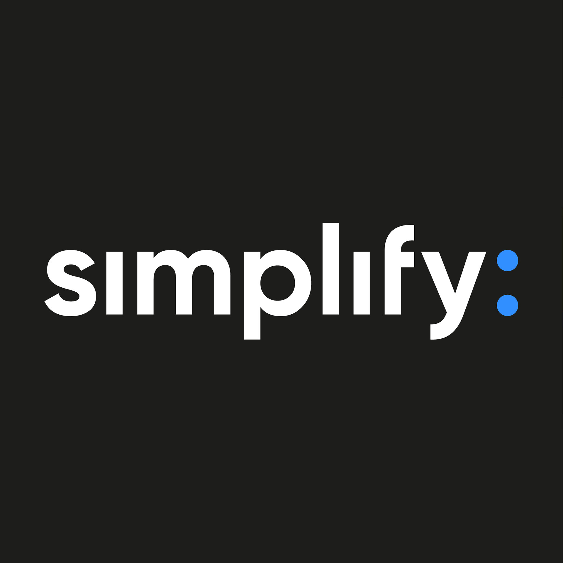
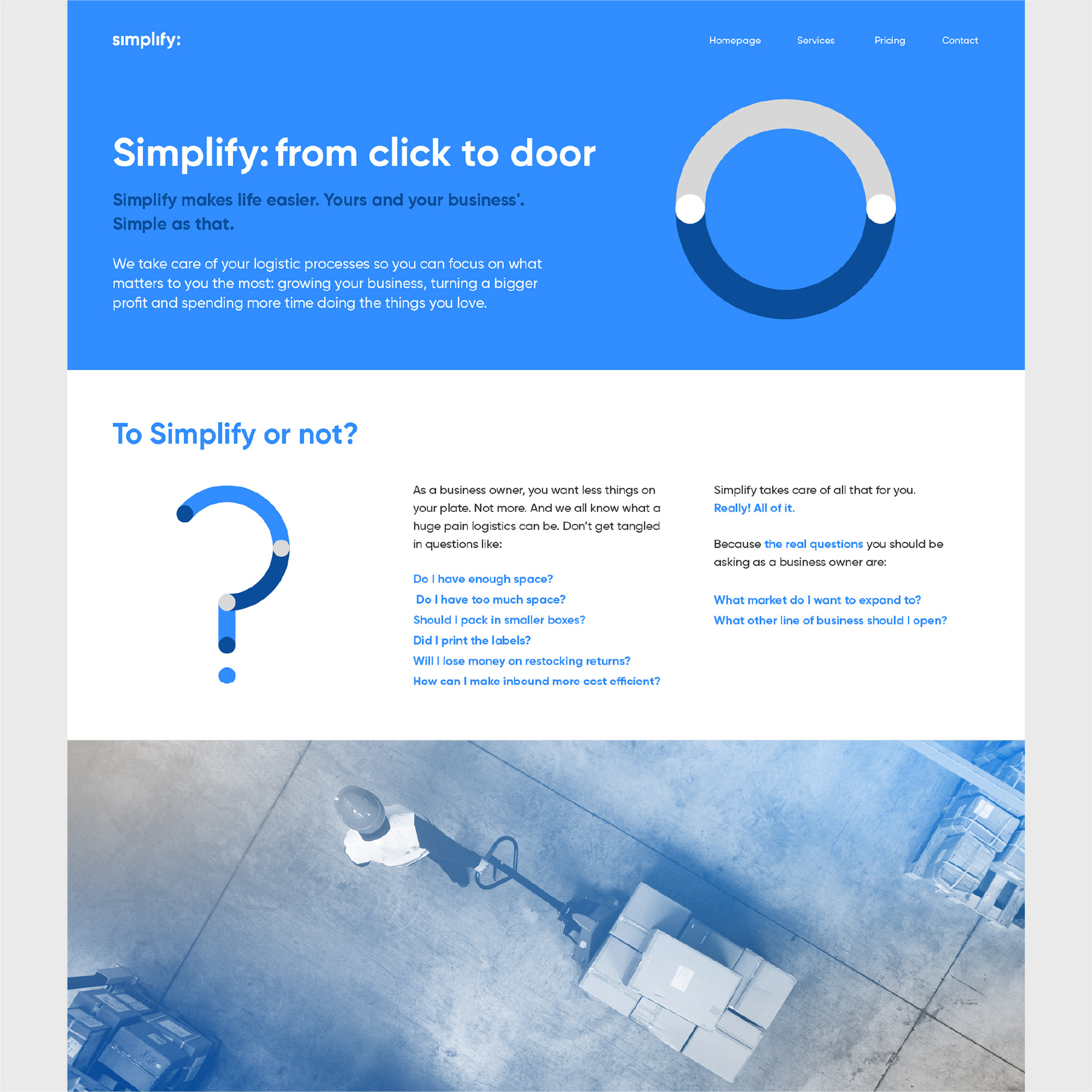
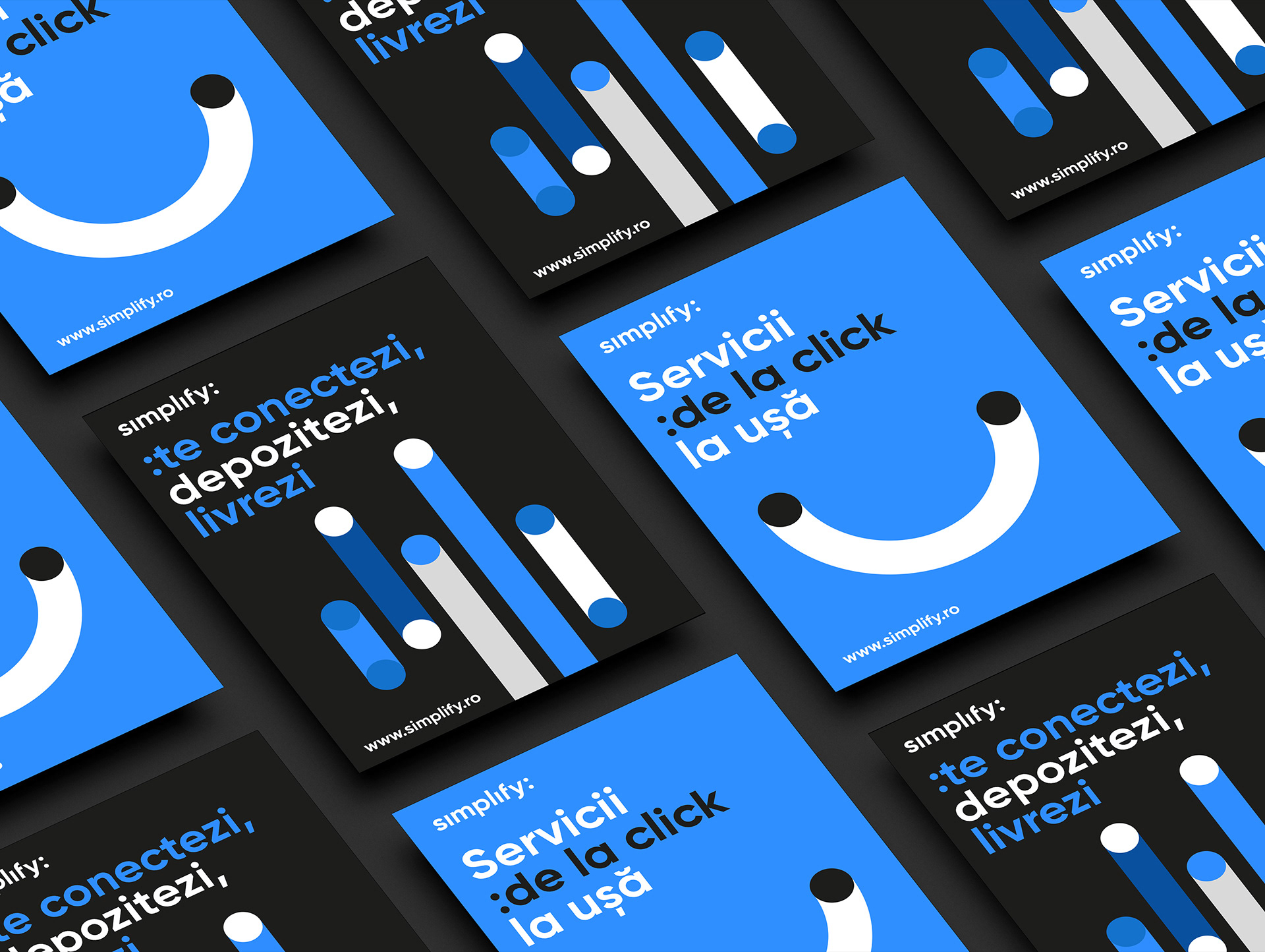
Simplify isn't just the name of KLG Europe's fulfilment start-up, but also its mission. This is a brand that helps businesses simplify their logistics and lets owners focus on what really matters in a company. The naming we did is made complete by the visual identity designed to be simple & suggestive: hence the colon symbol used in the logo.
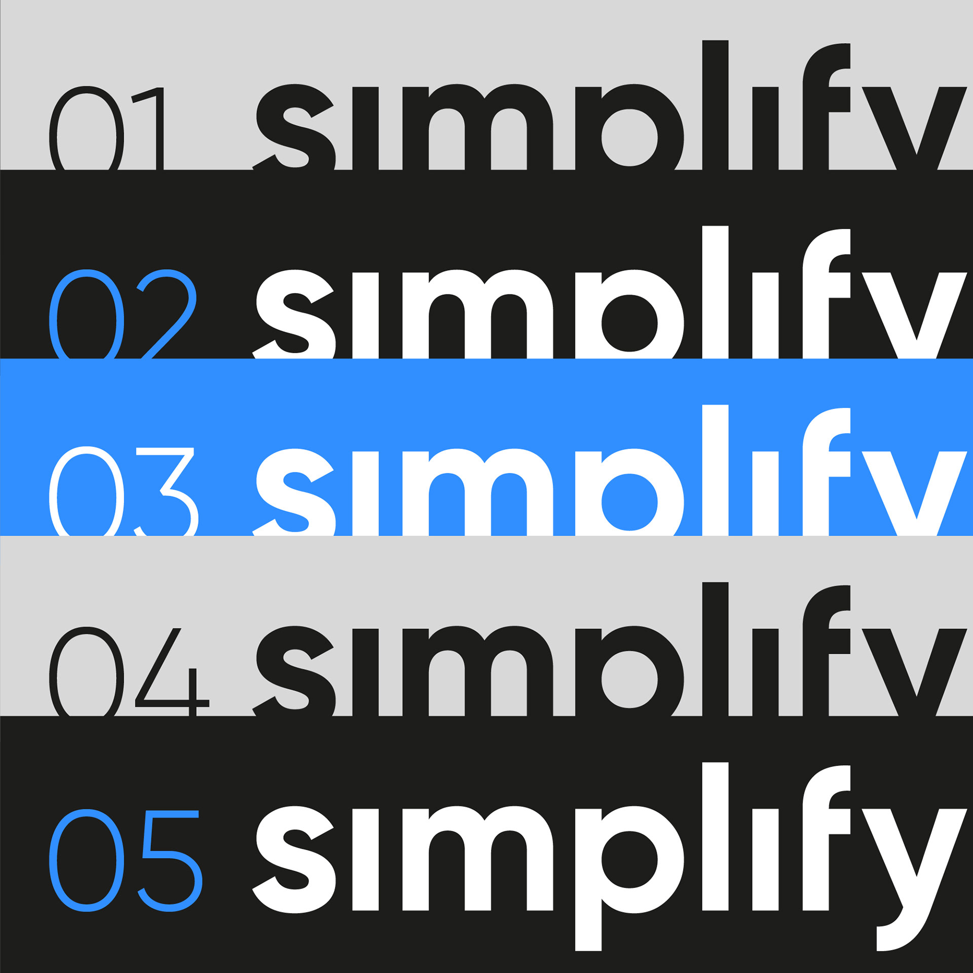
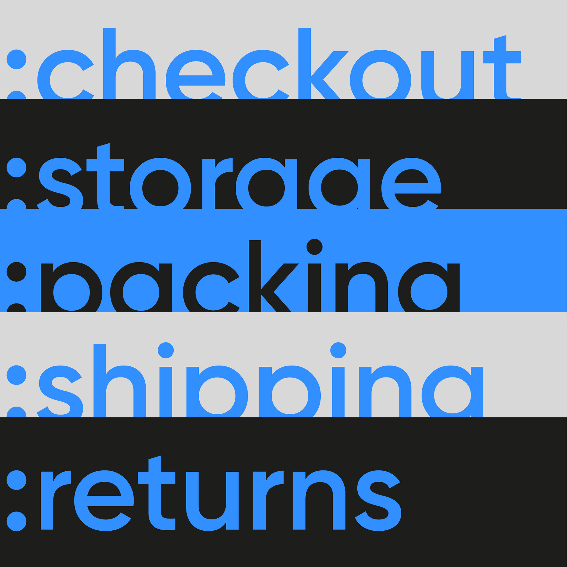
The colon is the perfect visual device to use in all kids of design situations: services presentation, price points and all things list. It's also spot-on to remind the audience of the multitude of advantages one has when letting Simplify simplify businesses.
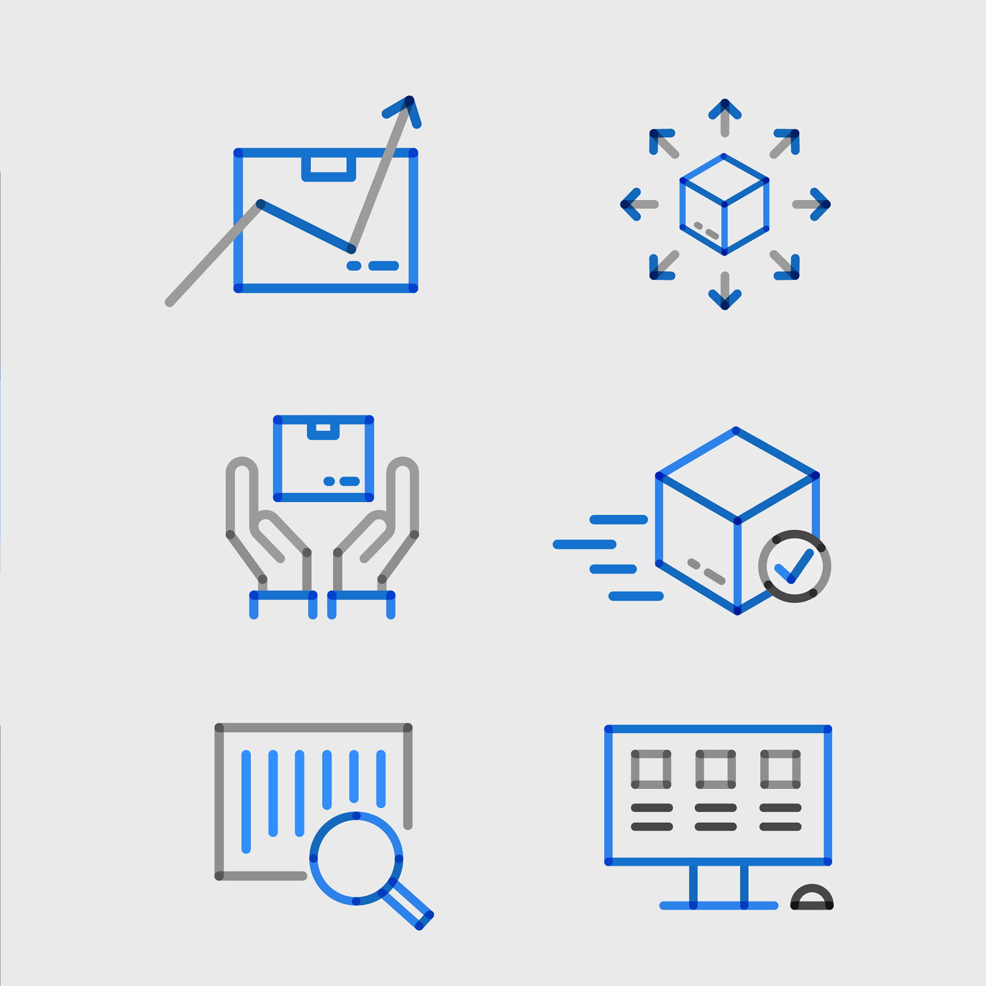
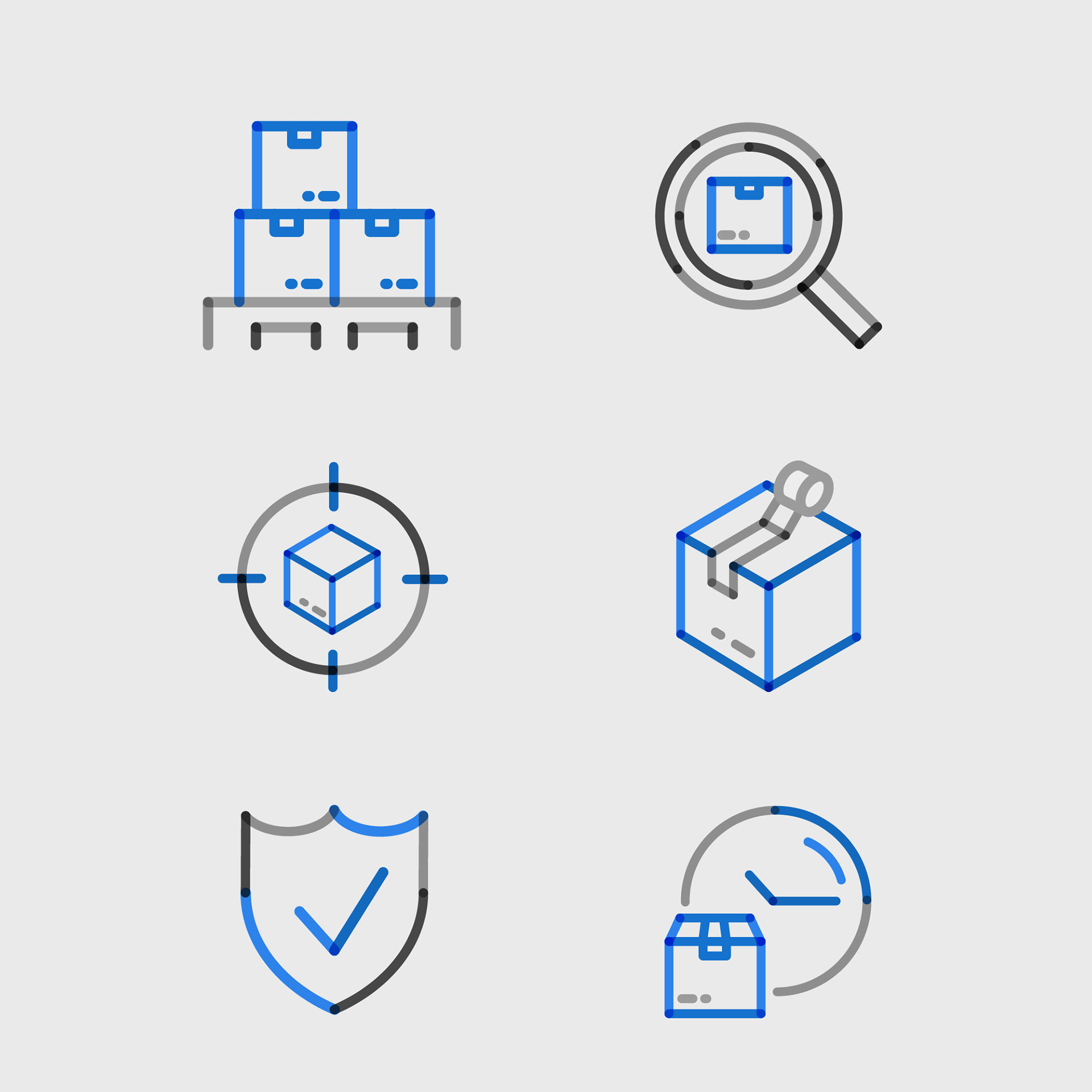
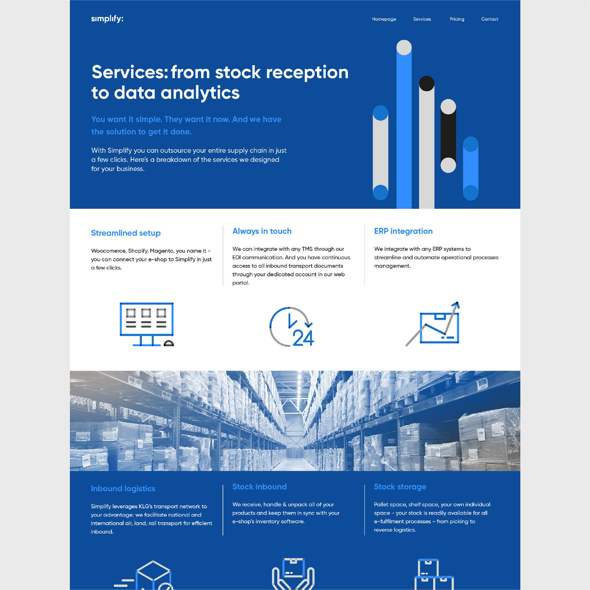
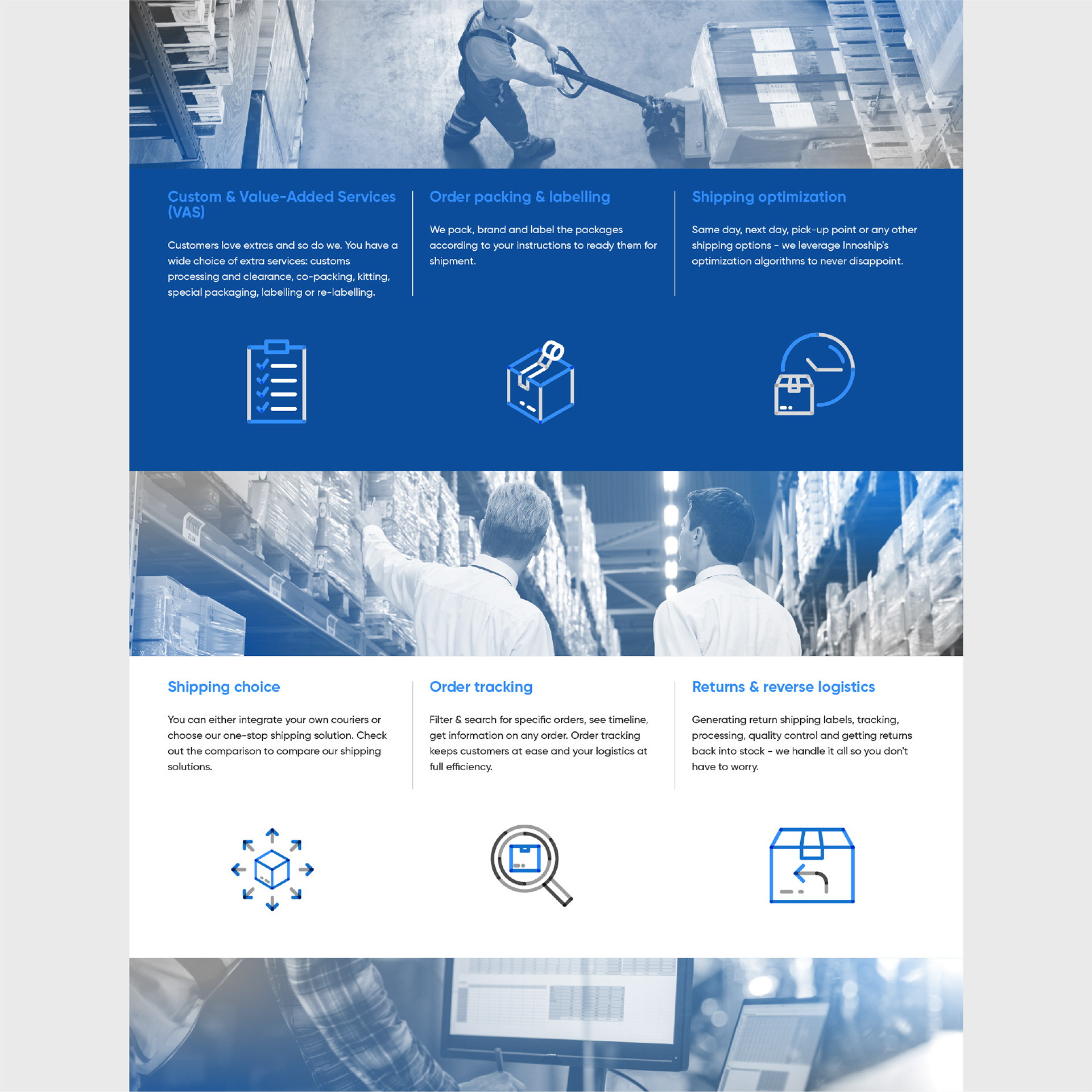
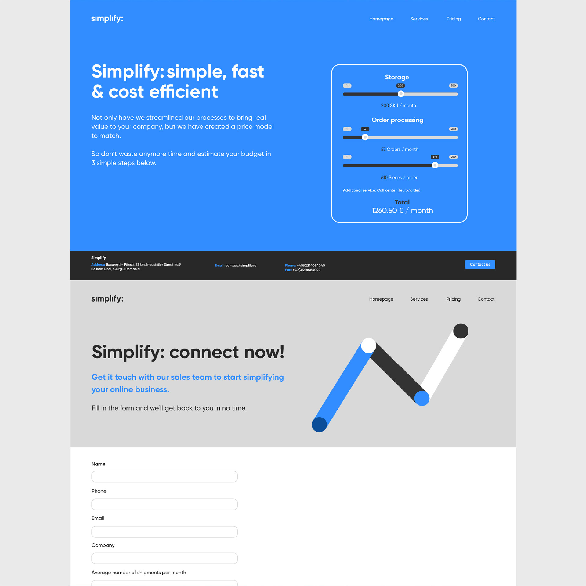
We've also designed Simplify's website using clean-cut graphics to once again tell people that's what we're all about. Custom illustrations and beautifully simple animations drive the message home.
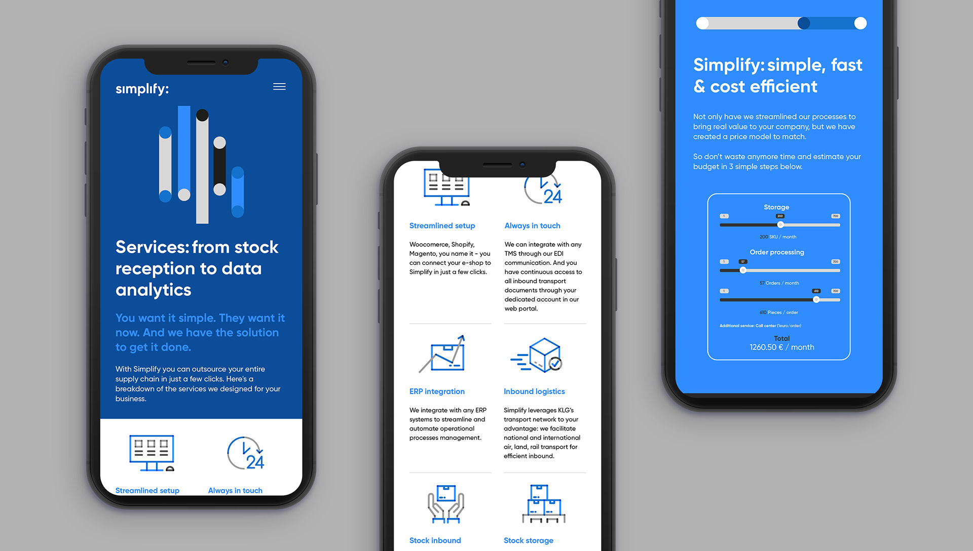
Streamlined, suggestive and smooth animations by Cristi Iacob. Check out simplify.ro for the complete experience.