e-Factura was never going to be a brand built on flash. It had a harder job than that. A national digital system operating at the intersection of administration, finance, and technology, it needed to look credible, structured, and official from the first second. But it also needed to feel usable. Clear enough for businesses. Legible enough for everyday users. Human enough not to disappear into the usual visual language of state platforms, where complexity often arrives before clarity does. They came to us for a visual identity that could hold both sides at once. Technical and accessible. Institutional and intuitive. A system with architecture in it, but not stiffness. A financial platform that still remembers there are people on the other side of every screen.


That was the real challenge. Not simply to make e-Factura look modern, but to make it feel coherent. These kinds of systems often fragment visually in the same way they fragment in use. Too many signals. Too much rigidity. Too little connection between function and experience. So we built the identity around a few core ideas that could hold everything together: coherence, simplicity, continuity, connection. Then we pushed against them just enough with something softer. More organic. More fluid. More human. Because e-Factura may be technical and financial, but it is still about exchange, movement, people, and trust. That became the Glitch move. We did not treat the platform as a cold instrument. We treated it as a system designed to bring things together. Institutions and businesses. Data and action. Structure and ease of use. The brand had to make that visible before a single word was read.


e-Factura: Logo Design & Visual System
The identity starts with the logo, where that balance is already built in. We created a custom wordmark that brings together a more organic, human lowercase e and the stability of Factura, combining the digital and the administrative in one clear gesture.
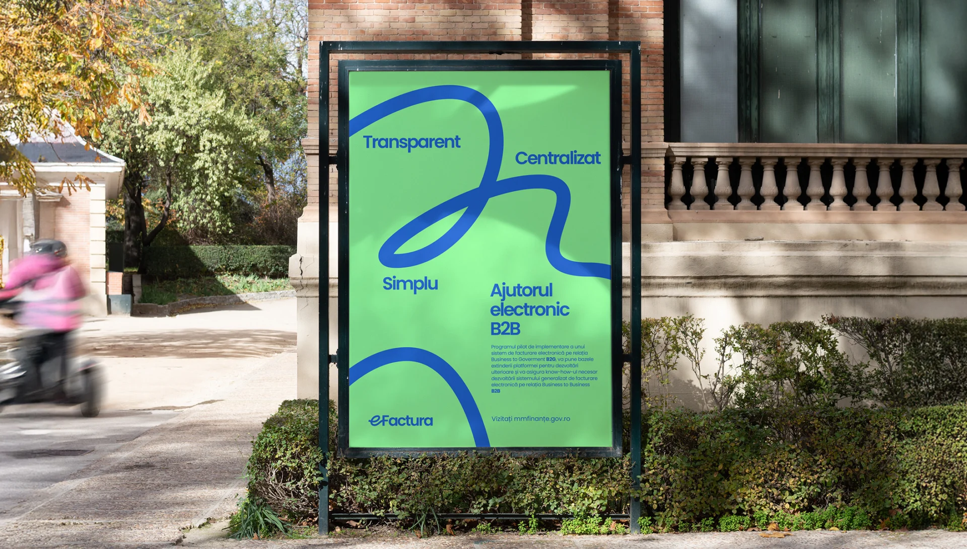
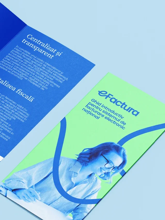
The key move happens right at the beginning. A connective stroke enters from the left, forms the e, and continues outward through the rest of the mark, exiting on the right as a visual idea of continuity, linkage, and flow. Not decoration. Structure. A simple gesture carrying the larger logic of the system. Connection, process, exchange, continuity. From there, the visual identity extends that same principle into a wider graphic language that feels organized without becoming rigid. The palette reinforces the same balance, led by a strong primary blue and supported by lighter, fresher secondary tones that keep the system open and contemporary. Photography grounds the identity in real use, with people, situations, and moments that keep the platform connected to everyday experience rather than abstract administration.

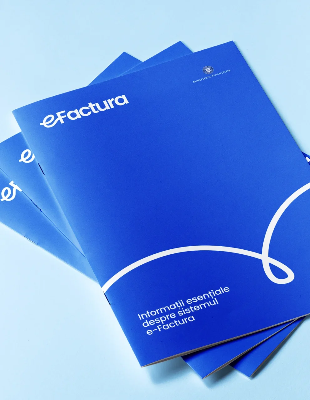
Beyond the logo, we built a visual language designed to scale across a full public-facing ecosystem. Fluid lines, graphic connectors, illustrations, icon sets, and structured layouts carry the identity from one application to the next without losing clarity. Typography plays a central role in that consistency, using Poppins Bold for headlines and subheads, Source Serif Regular for secondary emphasis, Poppins Light for body copy, and Poppins Regular for annotations.
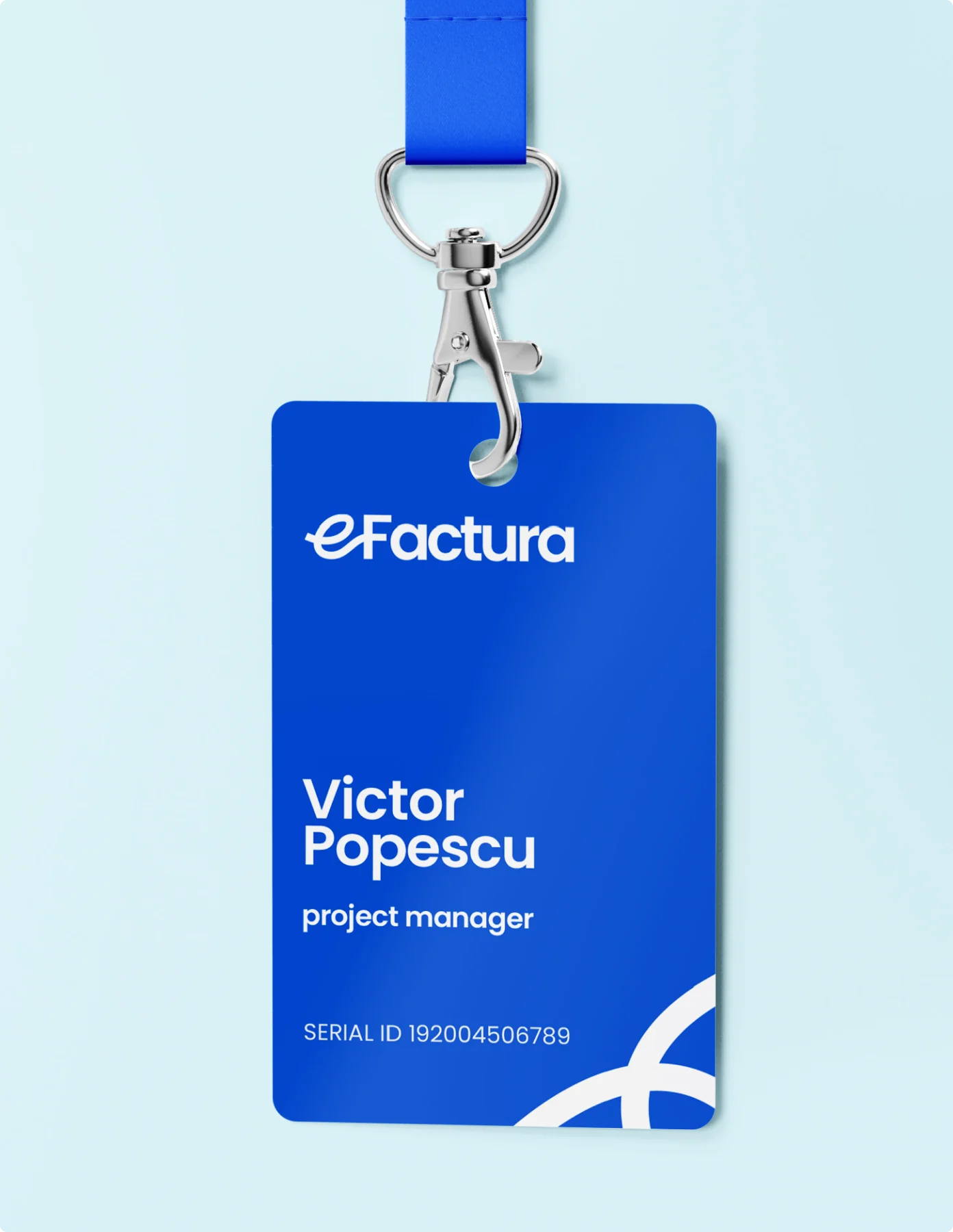
The hierarchy is clear. The tone is stable. The system works across stationery, business cards, social media materials, TV and multimedia promo assets, illustration suites, and broader communication applications. The result is not just a logo applied correctly. It is a full visual framework built to make a complex public platform feel more coherent, more navigable, and more recognizably human at every touchpoint.

The e-Factura project is one of the most complex identity systems in Glitch Studio’s portfolio , a national platform serving millions of Romanian businesses, designed to be both technically rigorous and genuinely usable. This is exactly the kind of challenge our commercial and social work prepares us for. You can access the e-Factura platform at mfinante.gov.ro. For design references that inform work like this, explore the Glitch Library.
Credits
Creative direction
Dan Stănescu
Strategy
Copywriting
Andrei Dragotă
Project management
Domnica
Ana Banu
Graphic Design & Storyboarding
Andrei Nicolescu
Animation
Colorbitor Studio