Scena9 is Fundația9’s culture desk turned up to stadium volume, a journalism platform founded in 2016 (and in print since 2018) that hunts down the questions hiding behind opening nights and headline names. Glitch refined the brand so its mission “Keep understanding and share everything you understand”, hits with editorial precision and front-row energy, ensuring the platform’s investigative edge stays as sharp as its wit. The Scena9 redesign was not simply a visual refresh , it was a strategic alignment between a platform’s editorial ambition and the systems that represent it visually. Glitch approached the brief holistically: from brand strategy and verbal guidelines to the typographic choices and color logic that now define Scena9’s presence across print, digital, and social channels.
Redesign Concept
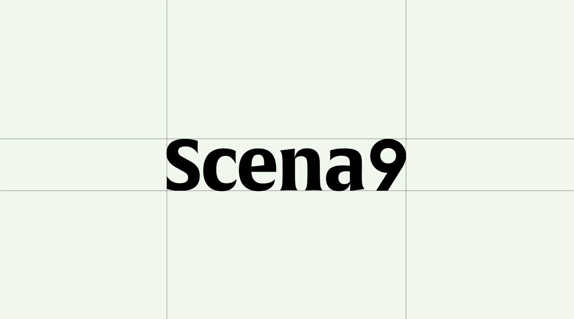
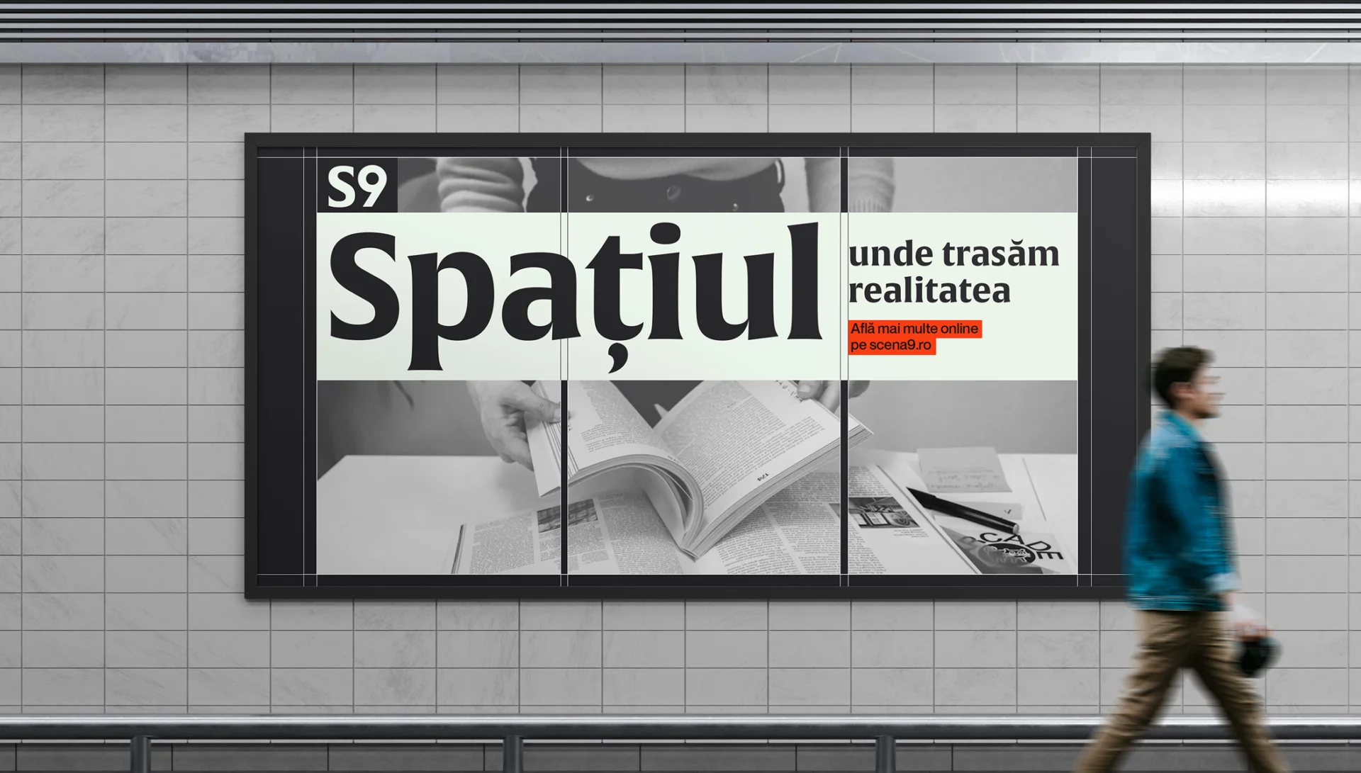
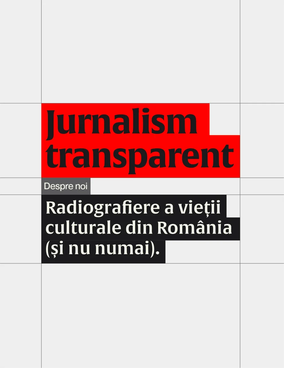
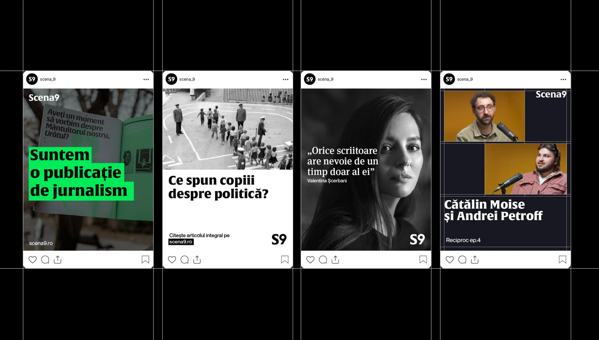
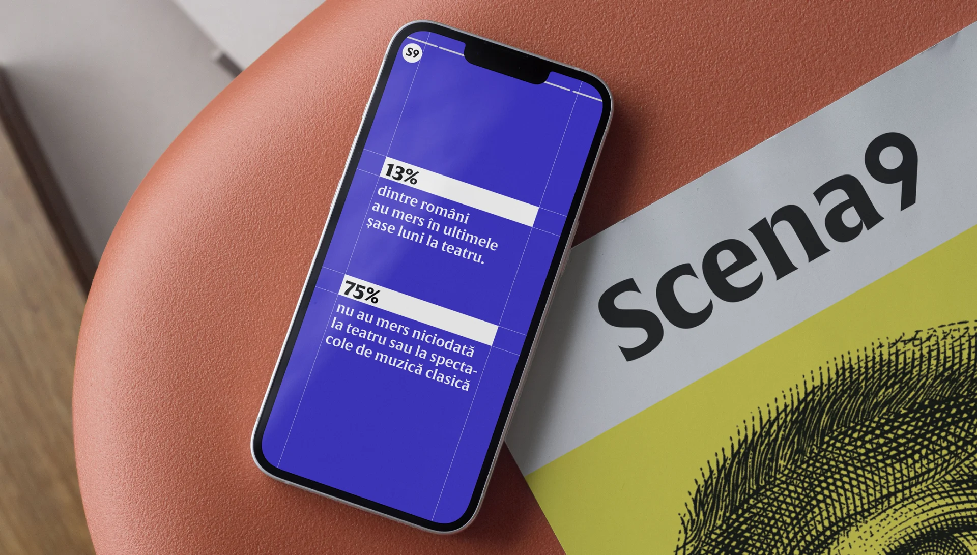
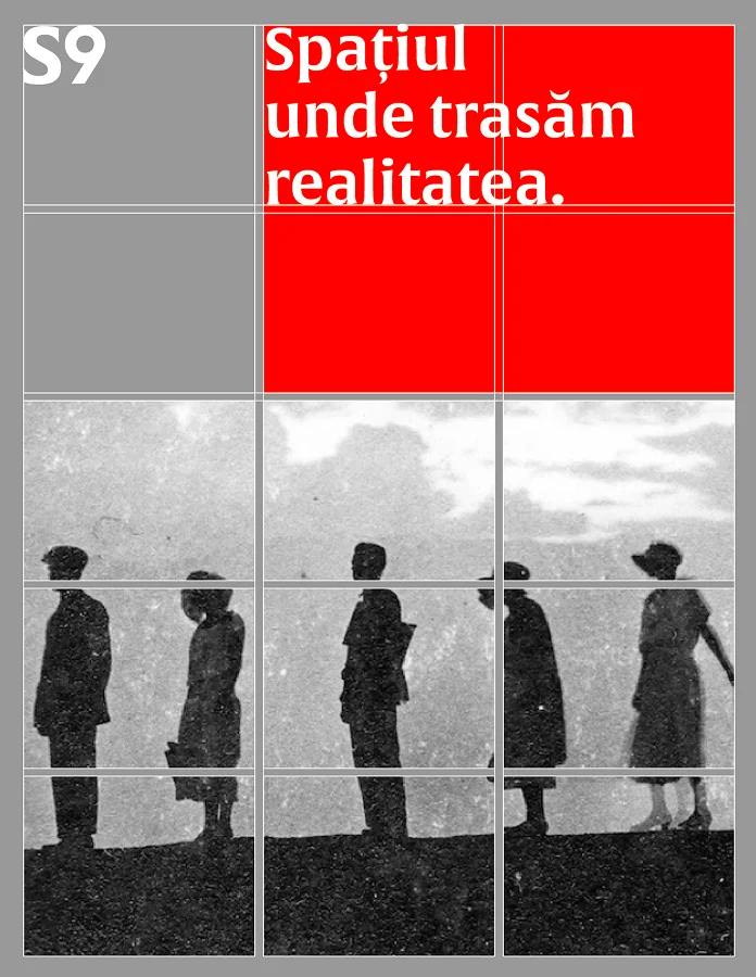
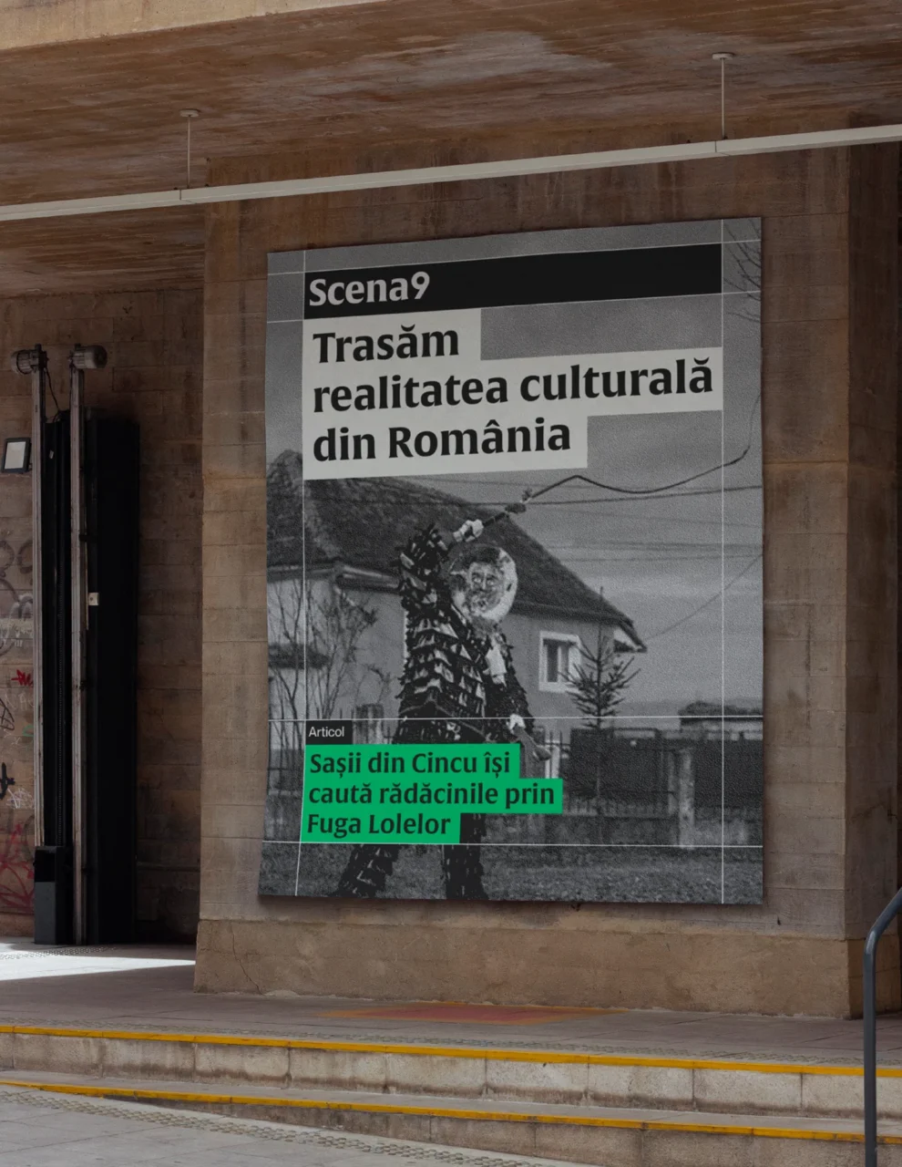
The visual identity drags the editorial grid out from backstage and throws it under the spotlights. Columns, gutters and baseline ticks become design elements: type snaps to them, images respect them, empty squares breathe like silent beats between verses. Saturated ink-blue anchors the palette while accent reds mark the must-reads, giving Scena9 an instantly recognisable rhythm that keeps scrolling eyes (and print readers) engaged. The Scena9 identity system was built to flex across web, print, and social formats without ever losing the platform’s signature edge , sharp, considered, and always editorially coherent.
The redesign also considered how Scena9’s dual format , digital-first journalism and a printed magazine , demands a visual language that works at two very different scales. The grid became the common denominator: fluid enough for digital layouts, rigid enough for print production. The flag-inspired logo sits at the center of both worlds, anchoring the Scena9 brand whether it appears as a browser favicon or a full-bleed magazine cover.

Scena9 Delivery & Brand Governance
Scena9’s editorial voice is distinctly Romanian, but its ambition is European. That duality shaped every brand governance decision: consistency that reads clearly across cultures, personality that remains unmistakably tied to its Bucharest origins. The brand manual delivers 3 primary outputs: a digital style guide, a print production manual, and a social media toolkit , giving Scena9’s editorial team the tools to act independently while keeping the brand coherent at every touchpoint.
A serif-grotesk type duo, grid-locked motion rules and a library of layout modules guarantee that essays, podcasts and festival posters all speak fluent Scena9. Every asset lives in a no-nonsense brand manual , column ratios, breakpoint maps, do-and-don’t grids , so editors and designers can improvise without ever losing the downbeat. Cultural journalism, still hot off the press, now lands with trademark clarity every single time. The Scena9 brand system gives the platform the structural confidence to grow: new formats, new contributors, new platforms , all anchored to one recognisable identity. You can explore the Scena9 platform at scena9.ro.
The Scena9 project sits at the intersection of culture and communication , exactly where Glitch Studio does its most focused work. As a purpose-driven communications agency, we brought the same strategic depth we apply to cultural campaigns and social projects to this brand refresh, ensuring the result matched Scena9’s editorial ambition from the first grid line to the final layout module. This kind of work , where editorial identity meets visual precision , is what drives us most as a team. Every decision, from typeface selection to spacing conventions, was made in service of Scena9’s mission: to help Romanian culture be understood more widely and appreciated more deeply. You can see more of our cultural work in our project portfolio.
Creative direction
Dan Stănescu
Brand Strategy
Simina Leotescu
Project management
Domnica Stuparu
Sonia Panait
Graphic Design
Ana Maria Dudu
Andrei Nicolescu