Client:
Centrul Cultural Clujean
Sector:
Education, Culture
Year:
2023-2024
Type:
Strategy
Branding
Visual identity
Communications
Brand manual
QUB is a centre for science and art in Cluj-Napoca, developed by Cluj Cultural Centre. Its programmes bring children, teachers and the wider community together through experimentation, making and discovery. We worked on the brand strategy, visual identity and communications, giving its purpose a clear expression: opening minds at every age. From the first invitation to a workshop to the materials people use there, the identity gives curiosity a visible, recognisable place in everyday life.



Opening minds
“Deschizător de minți la orice vârstă”. An opener of minds, at every age. This idea places curiosity at the centre of QUB and gives the organisation a way to speak to children, teachers and parents through something they share.
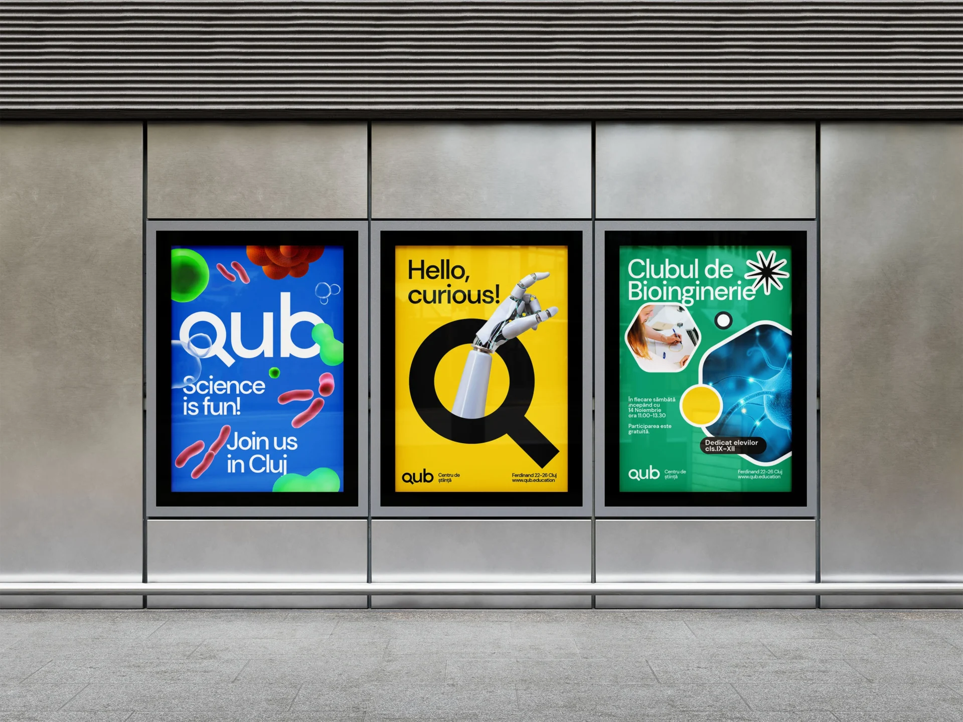
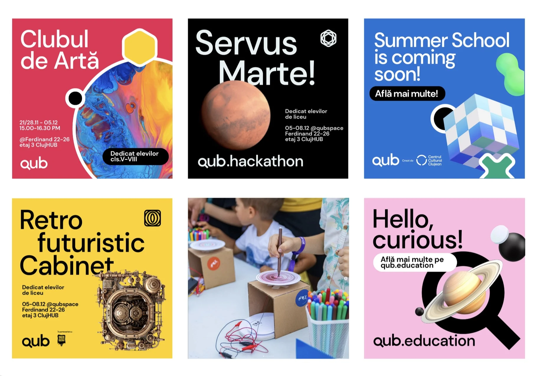
The visual identity follows that invitation. The lowercase name feels accessible, while the Q becomes a magnifying glass: a frame for discovering the world of science and research. It can hold a robotic hand, microscopic life or an image from space. The subject changes; the invitation to look closer remains.
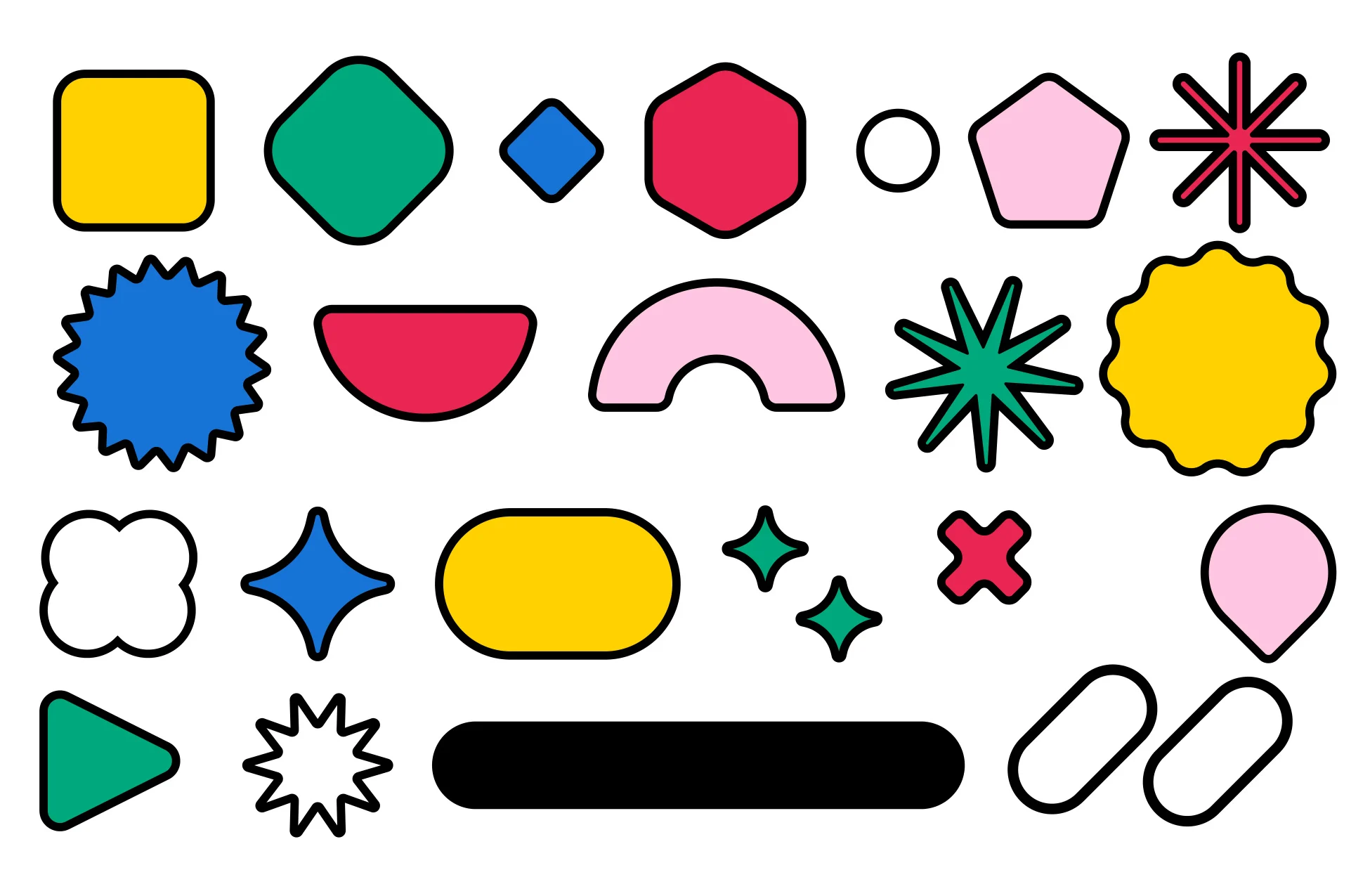
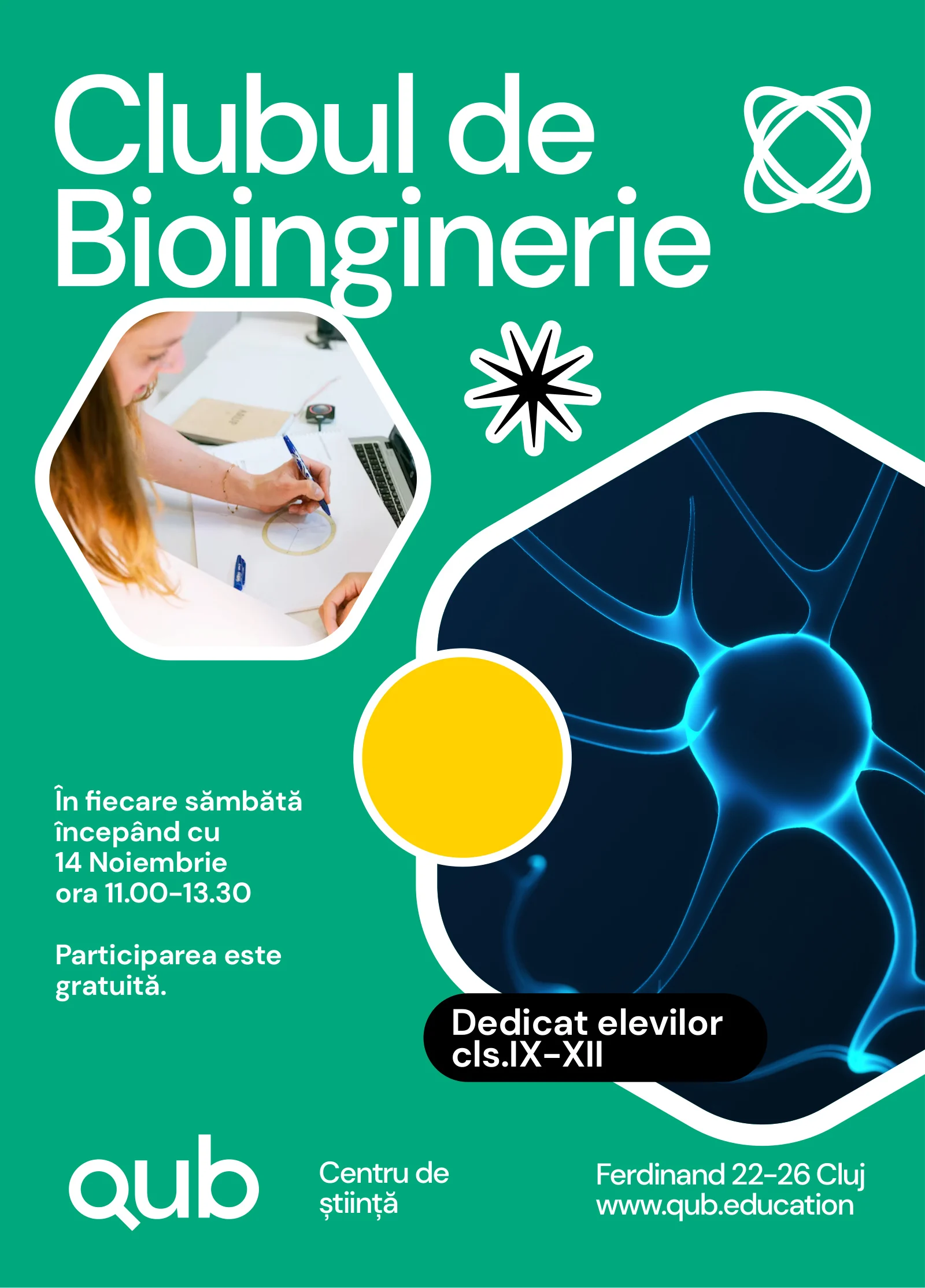
Bold typography, bright colour and geometric shapes give the system room to express different activities. Programme icons connect workshops, clubs and events to the wider QUB identity. Posters make an unfamiliar subject feel approachable; practical information explains how to take part. Across these applications, design helps the organisation turn a broad educational purpose into invitations that people can recognise and follow.
Applications
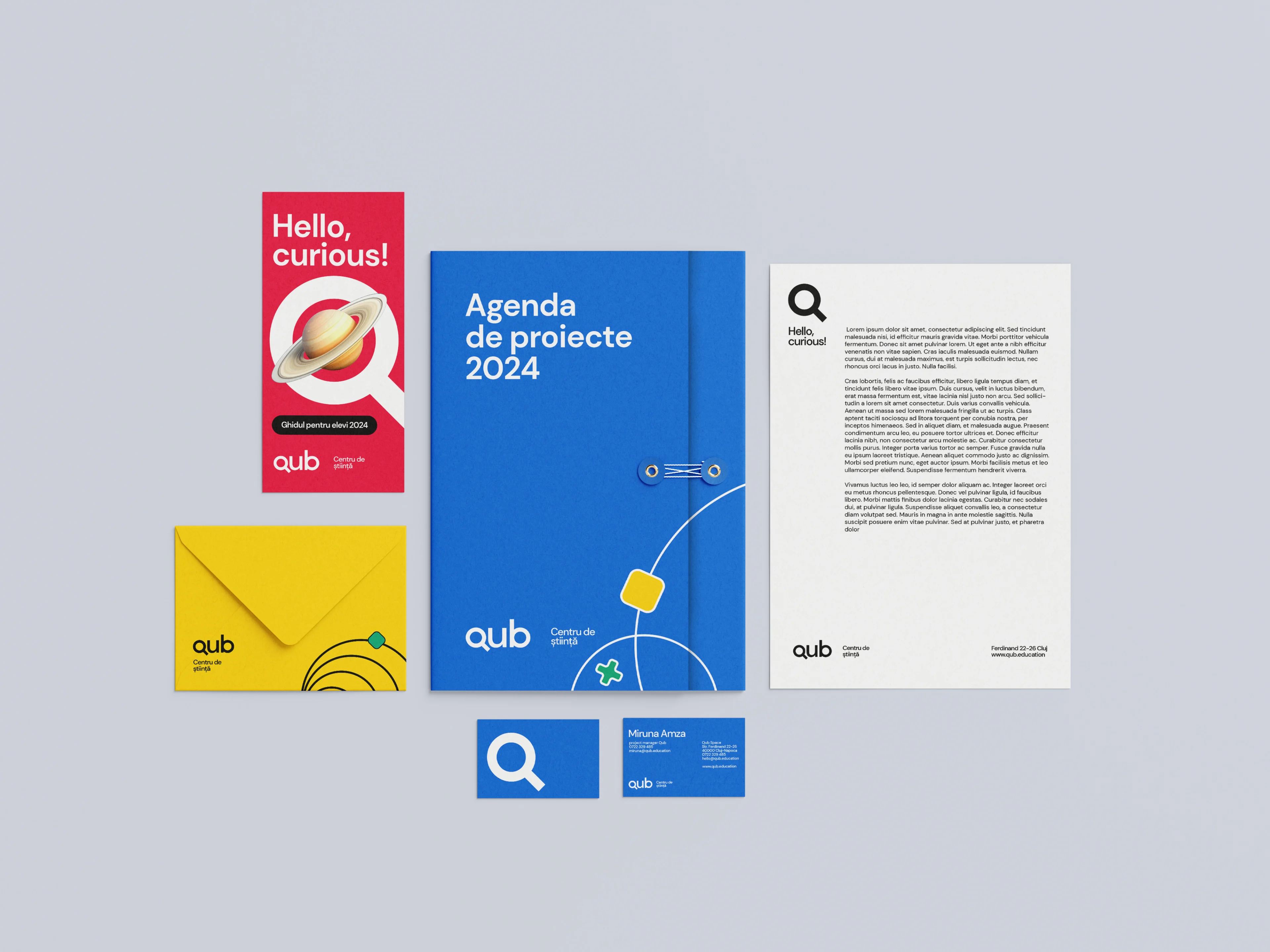
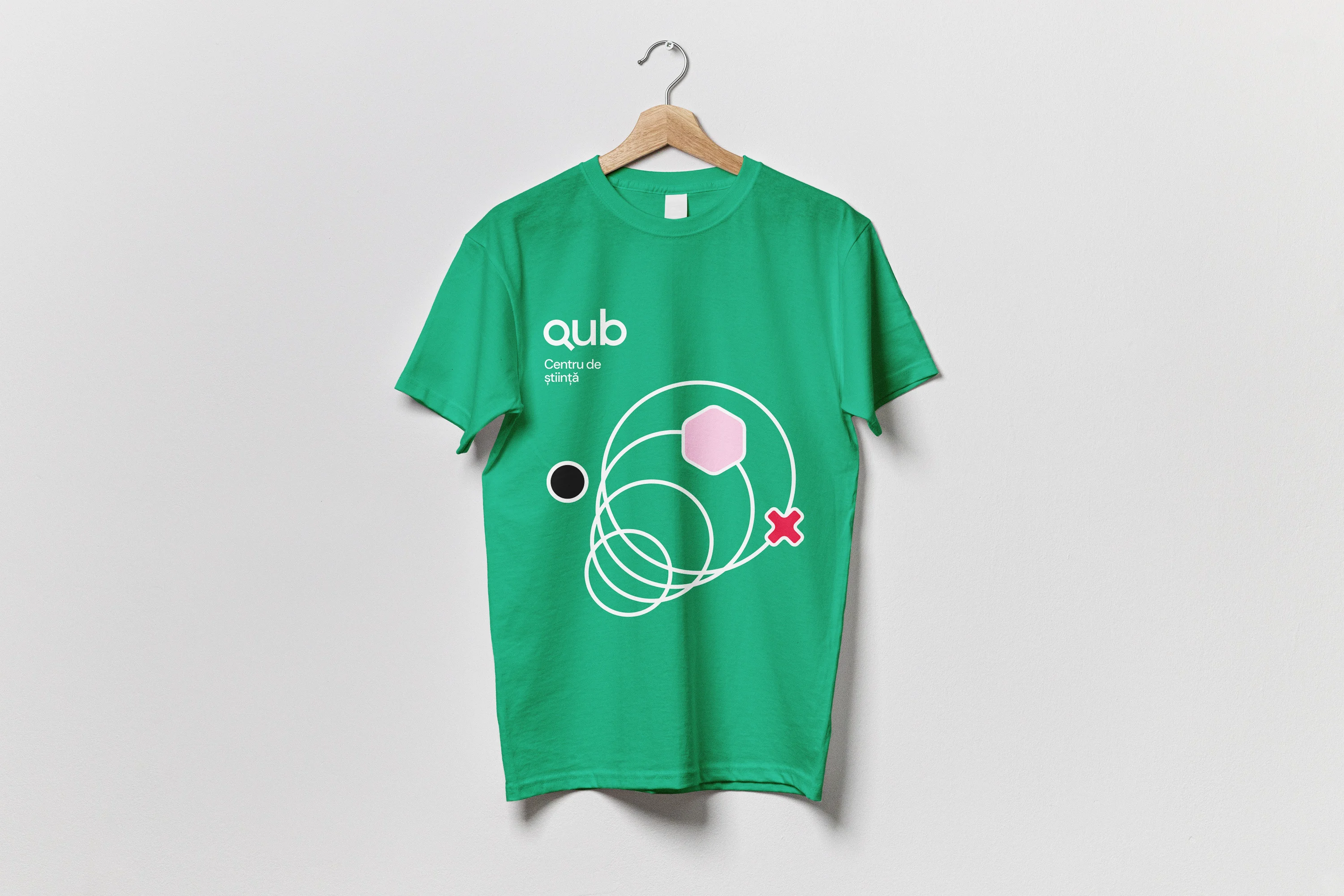
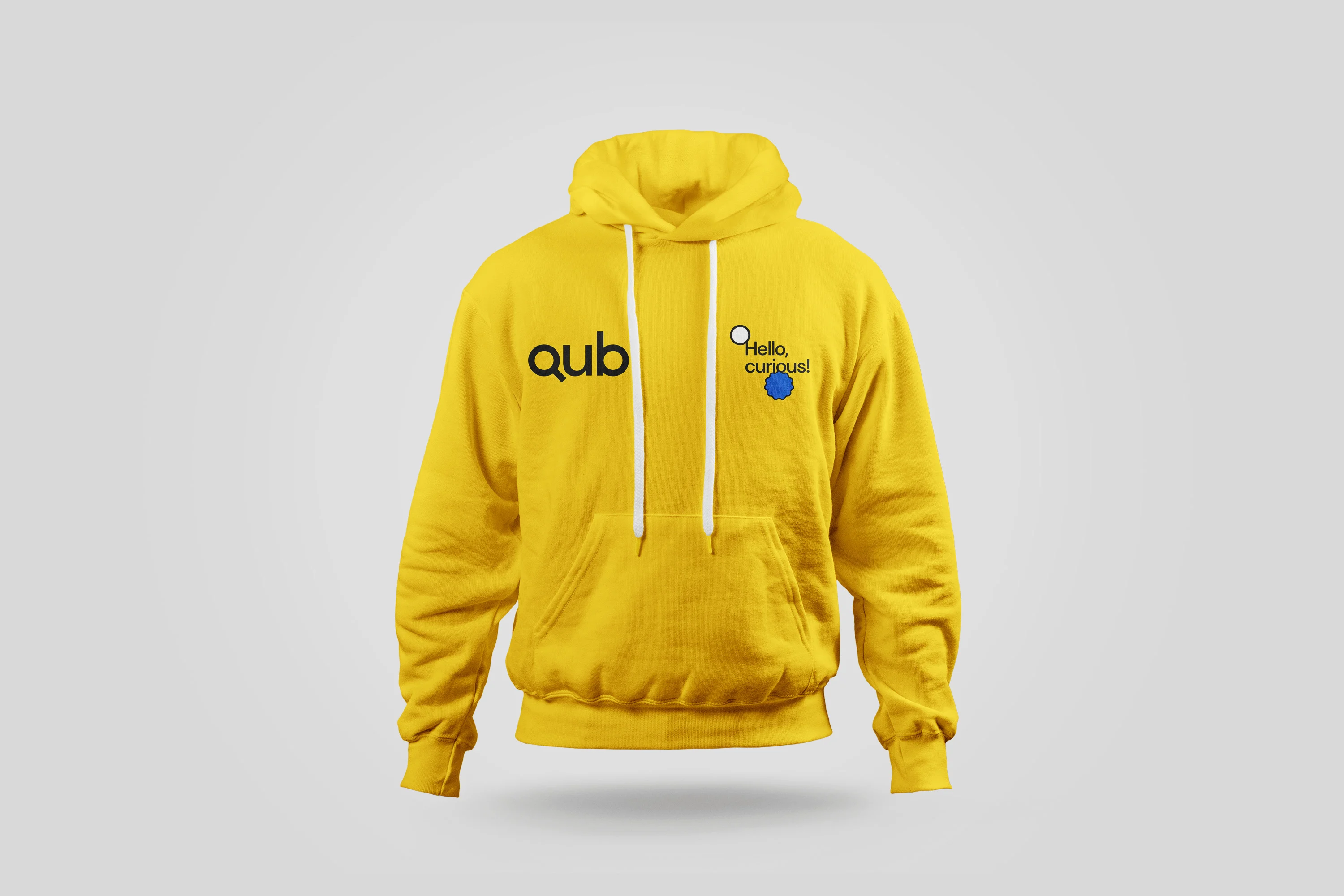
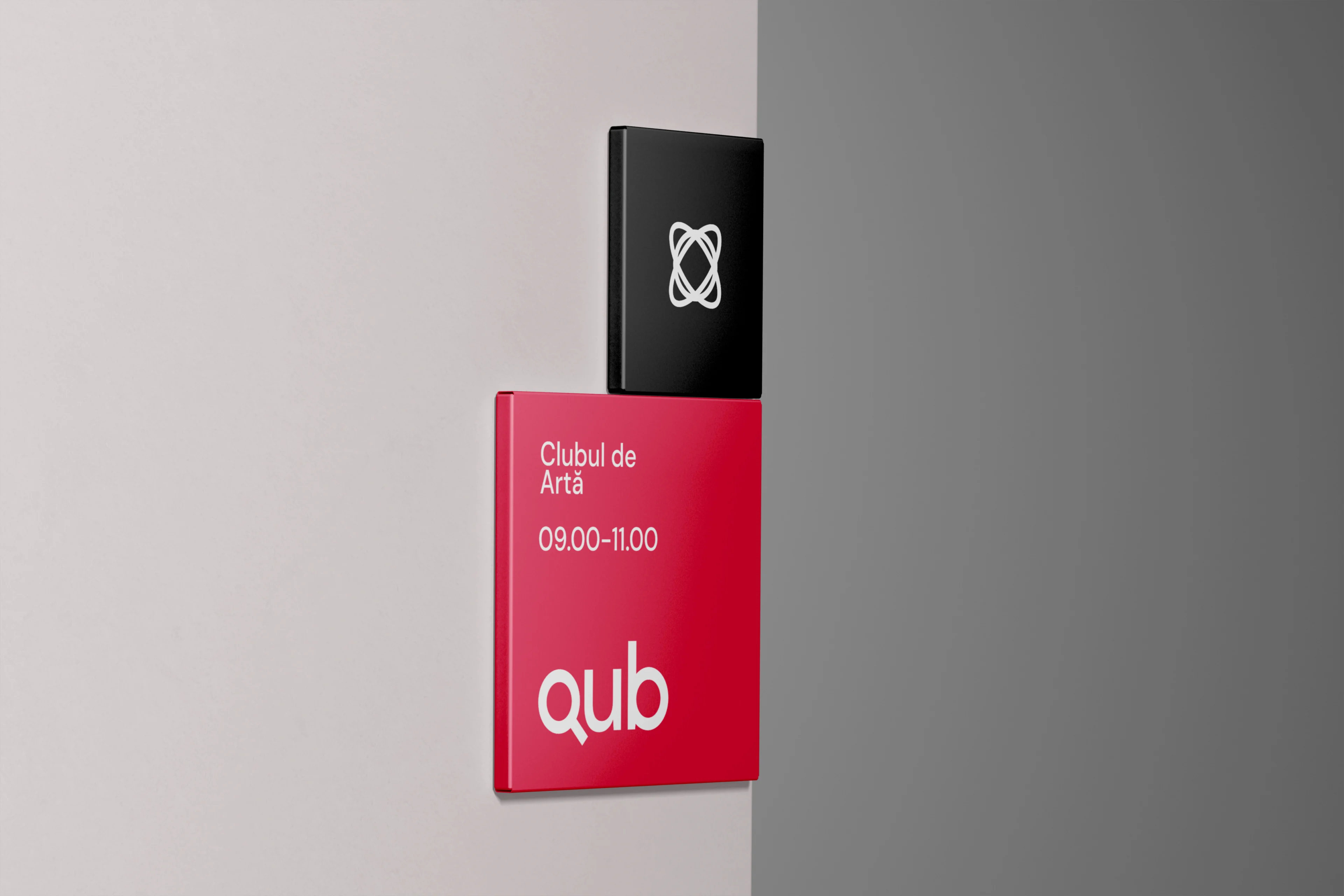
The identity extends from programme posters and digital announcements to stationery, signage and merchandise. Each application has a different job: to introduce an activity, guide someone through a space, or accompany the team in its daily work. A shared visual language keeps those encounters connected without making every message look the same.
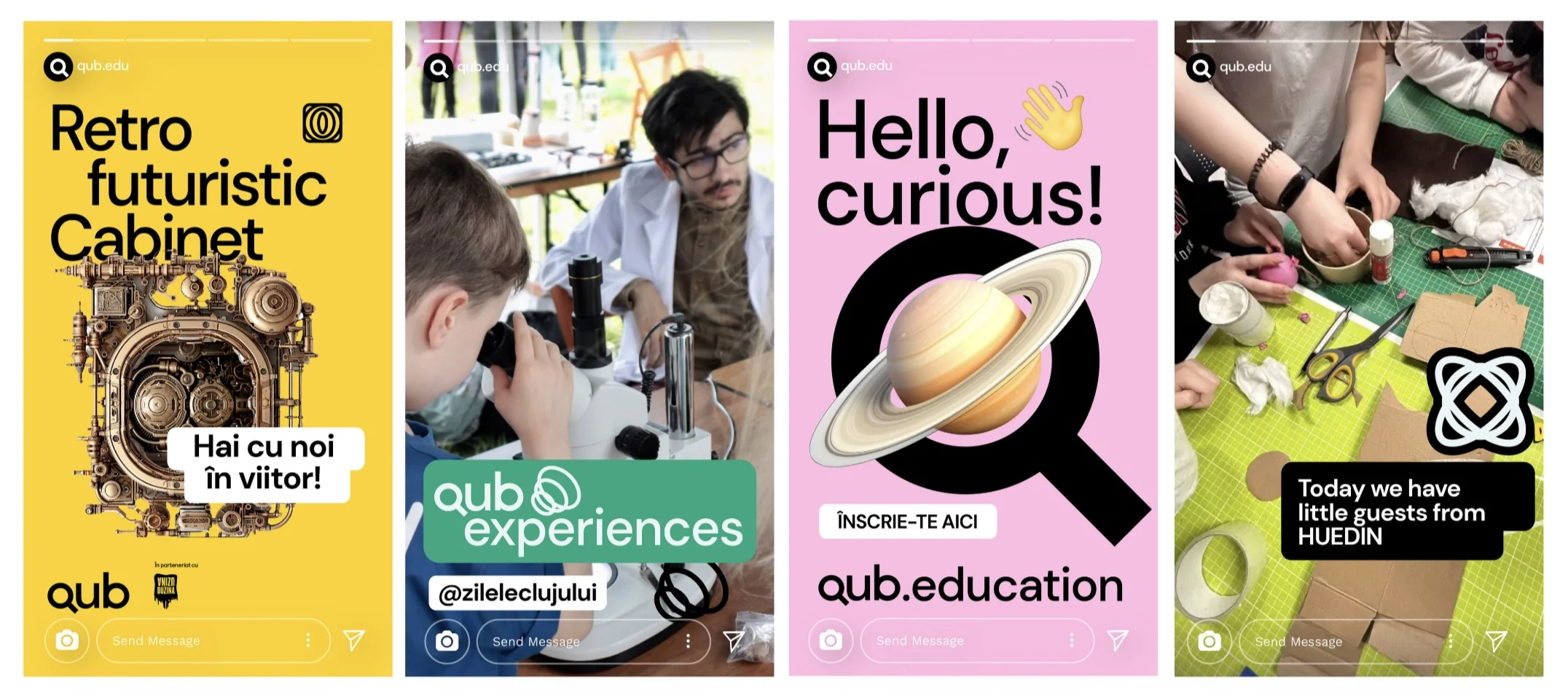
QUB’s communications use an accessible voice that explains, asks questions and encourages people to try things for themselves. That voice supports a programme built around learning through experimentation and making.
A manual for everyday use
A brand manual keeps the identity useful after launch. QUB’s brings together logo and partner lockups, colour, typography, programme icons, image use and templates.
It gives staff, designers and external collaborators a shared reference, helping them prepare new materials, welcome new colleagues and keep the organisation recognisable as its activities evolve.


About the project
QUB is a project of Cluj Cultural Centre. Glitch worked on brand strategy, visual identity, communications and the brand manual.
The applications shown include mockups from the identity system. Explore our work or read about our branding and design approach.
Project credits
Client
Centrul Cultural Clujean
Project
QUB
Location
Cluj-Napoca
Brand strategist
Irina Negrilă
Graphic designer
Andrei Nicolescu