Much like good education itself, educational projects need to explain clearly what their “curriculum” is all about, engage all parties around the teaching desk and the wider community, and give them the best tools to take part in the programme. That’s where branding and communication come in.
Work on projects like these can mean giving an arts & science centre a voice that welcomes questions instead of just teaching science. Making jam sessions out of study sessions for a music programme. Or turning school visits to theatres and museums into culture spotting. Across QUB, BeatAgora and Cai Verzi (“green horses” standing in for the “wild goose” in Romanian), we’ve learned how to make educational initiatives stand out, pull people in, and stay top of mind for the long term.
QUB: making curiosity visible
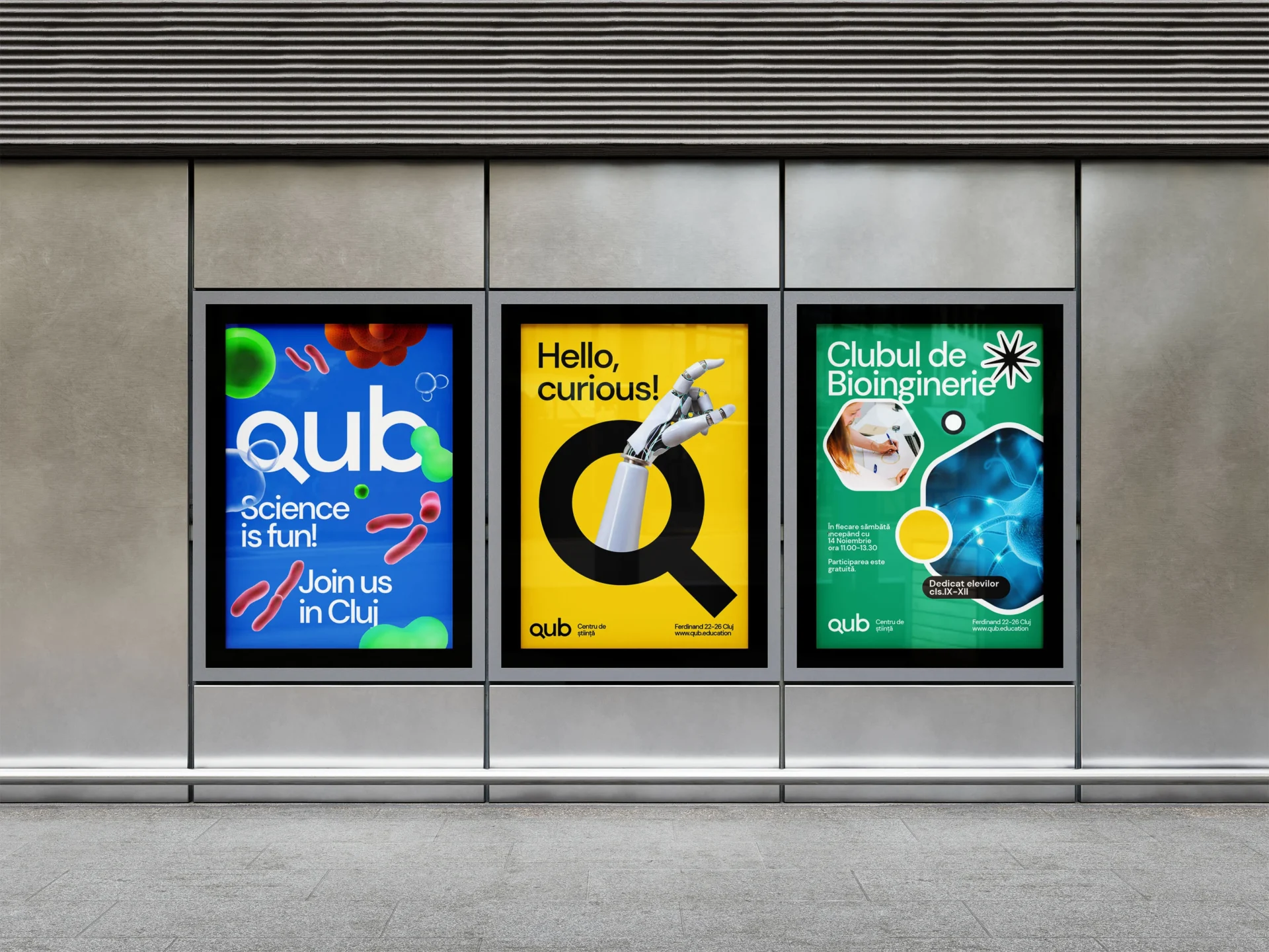
QUB is a centre for science and art in Cluj-Napoca, developed by Cluj Cultural Centre. Its programmes bring children, teachers and the wider community together through experimentation and making.
Our brand strategy expresses its purpose as “Deschizător de minți la orice vârstă”. An opener of minds, at every age. It gives the centre a way to speak to different generations through something they share: curiosity.
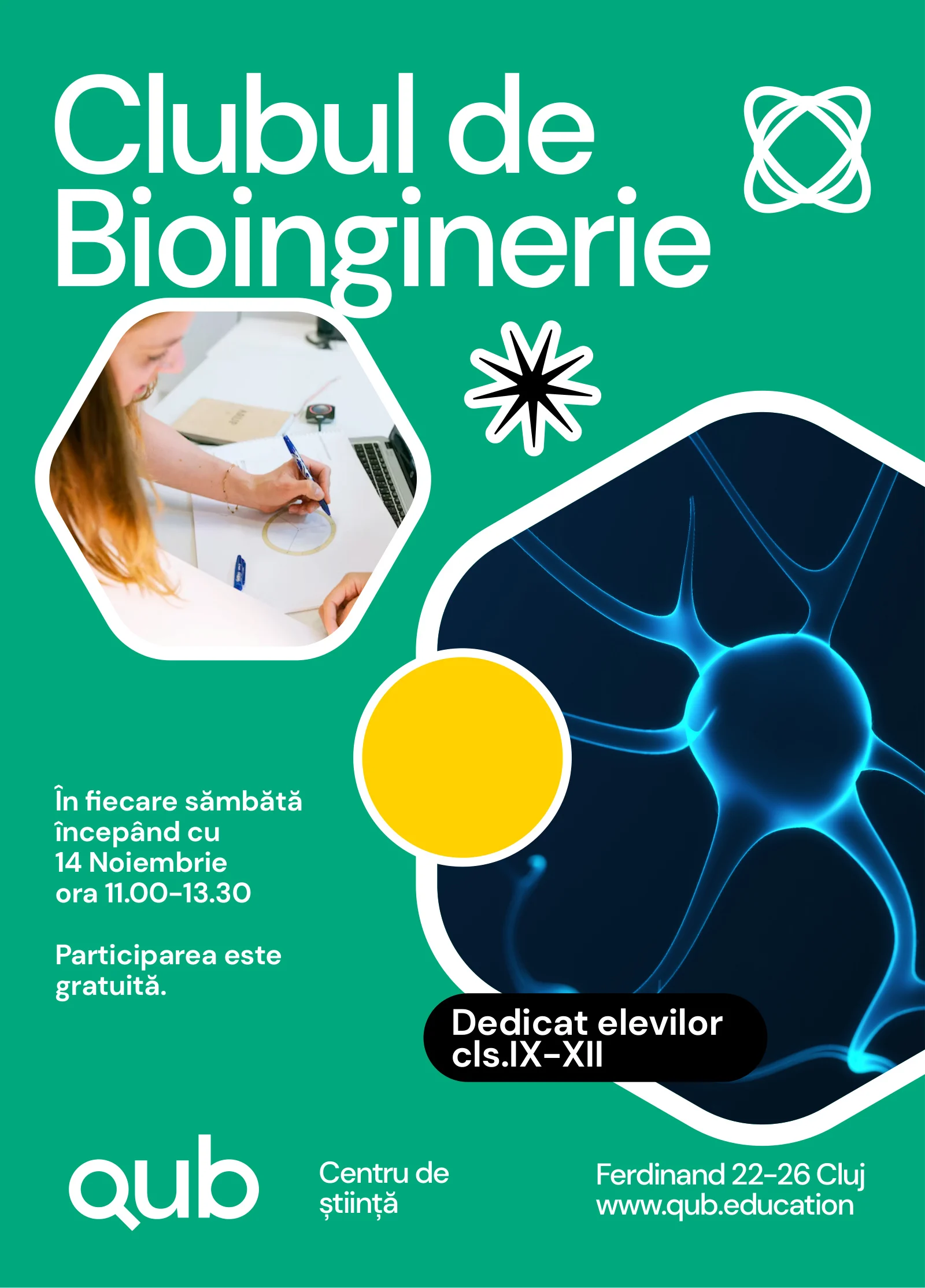
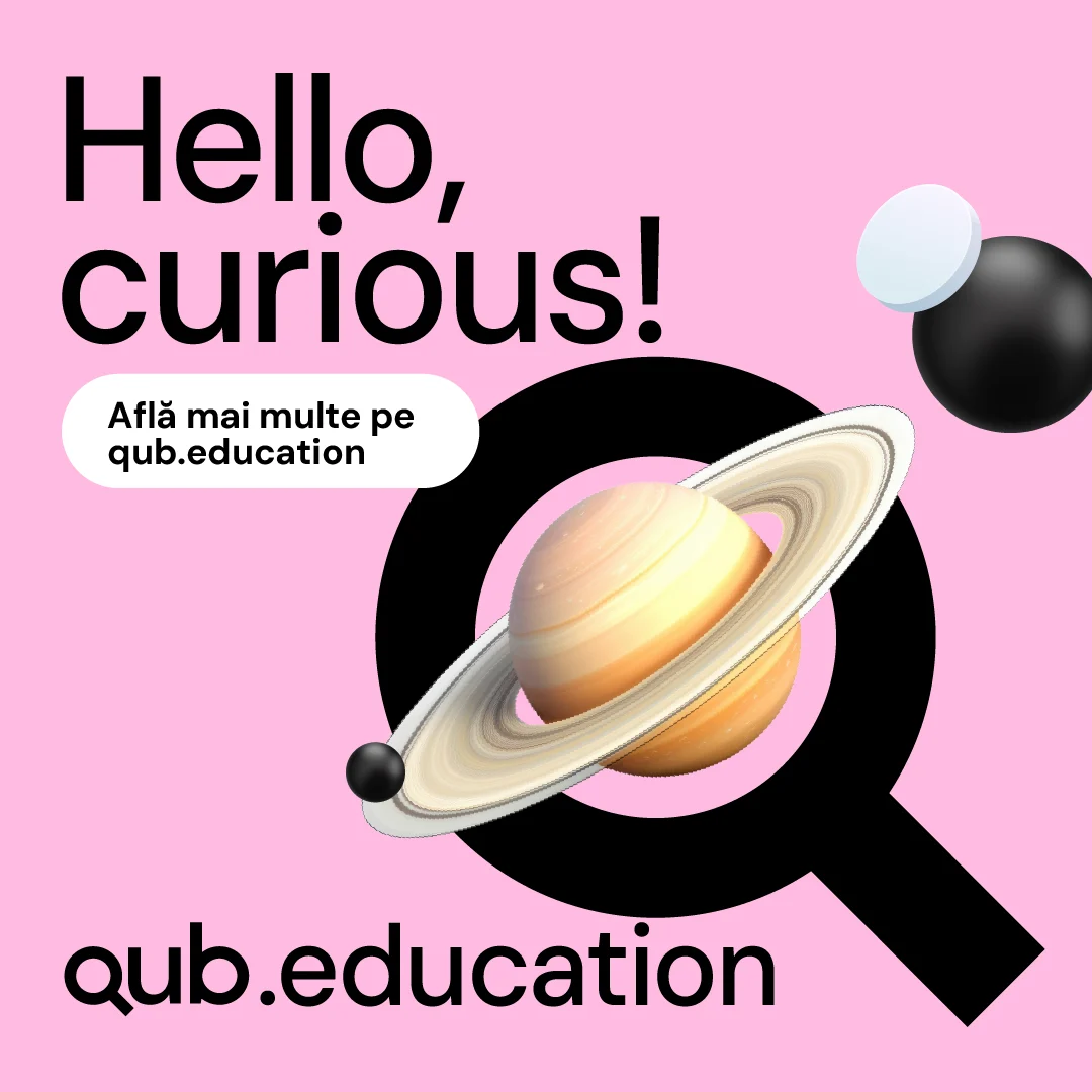
The visual identity turns that idea into an invitation. Bold typography and geometric shapes meet images from science. The Q frames anything from a robotic hand to microscopic life, connecting the centre’s name with the subjects people can discover there.
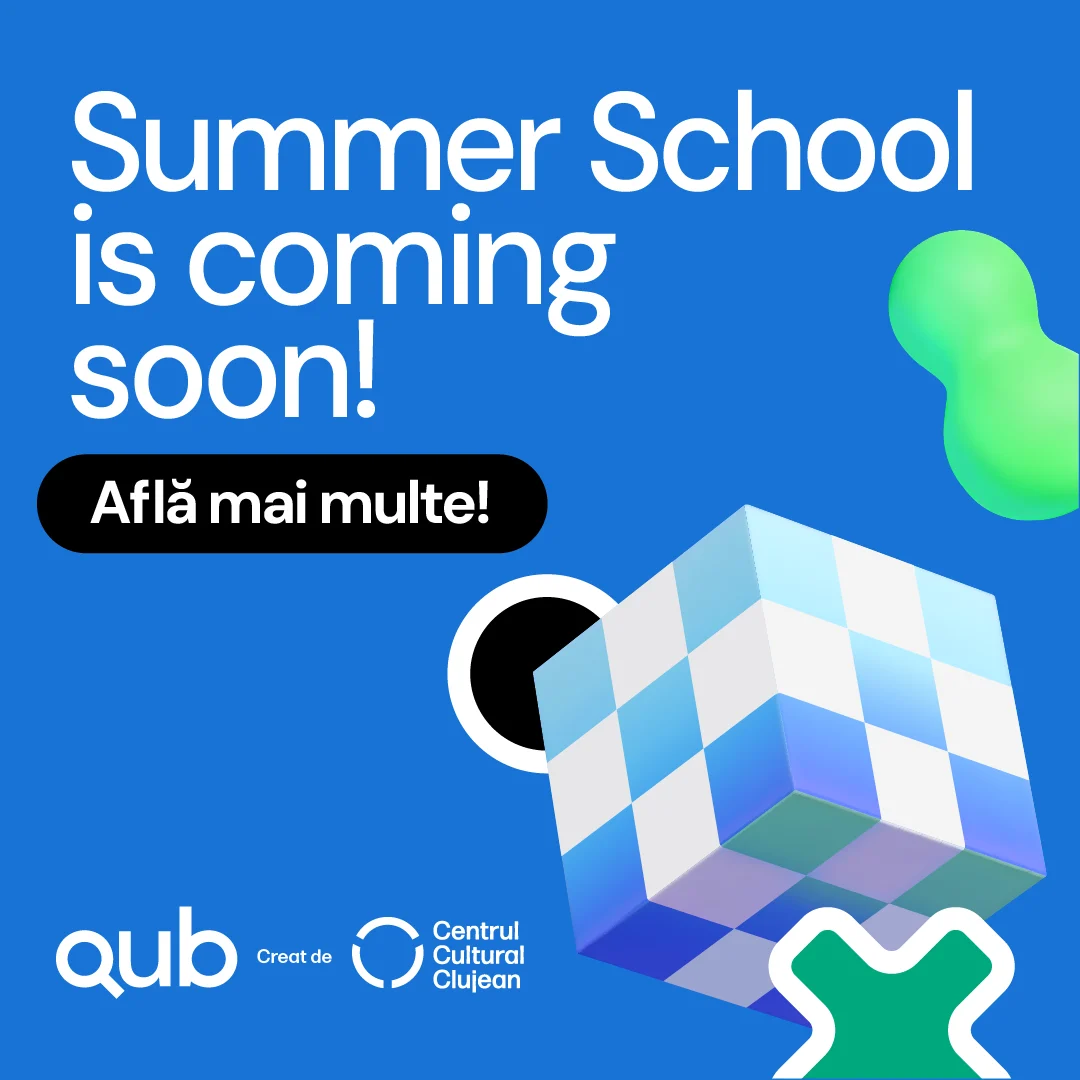
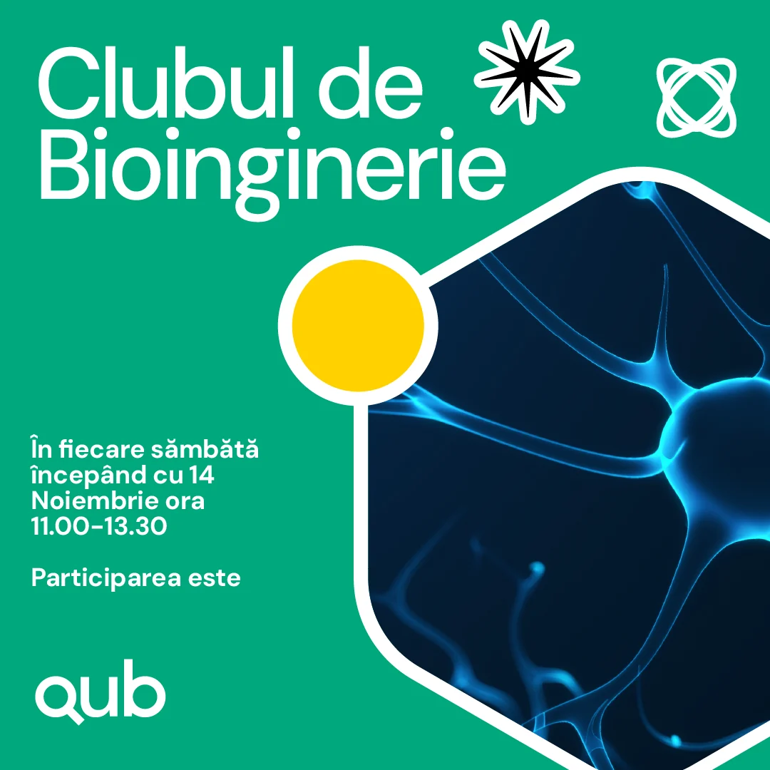
Across workshops, clubs and summer school announcements, the system makes room for different activities while keeping their connection to QUB clear. For a programme built around exploration, communications can help make an unfamiliar subject feel approachable and give people a clear starting point.





BeatAgora: a place in the band
BeatAgora brings instruments and music-making into schools. Initiated by Zoli Toth, with BRD Groupe Société Générale as founding partner, the programme gives young people the chance to learn instruments and form bands.
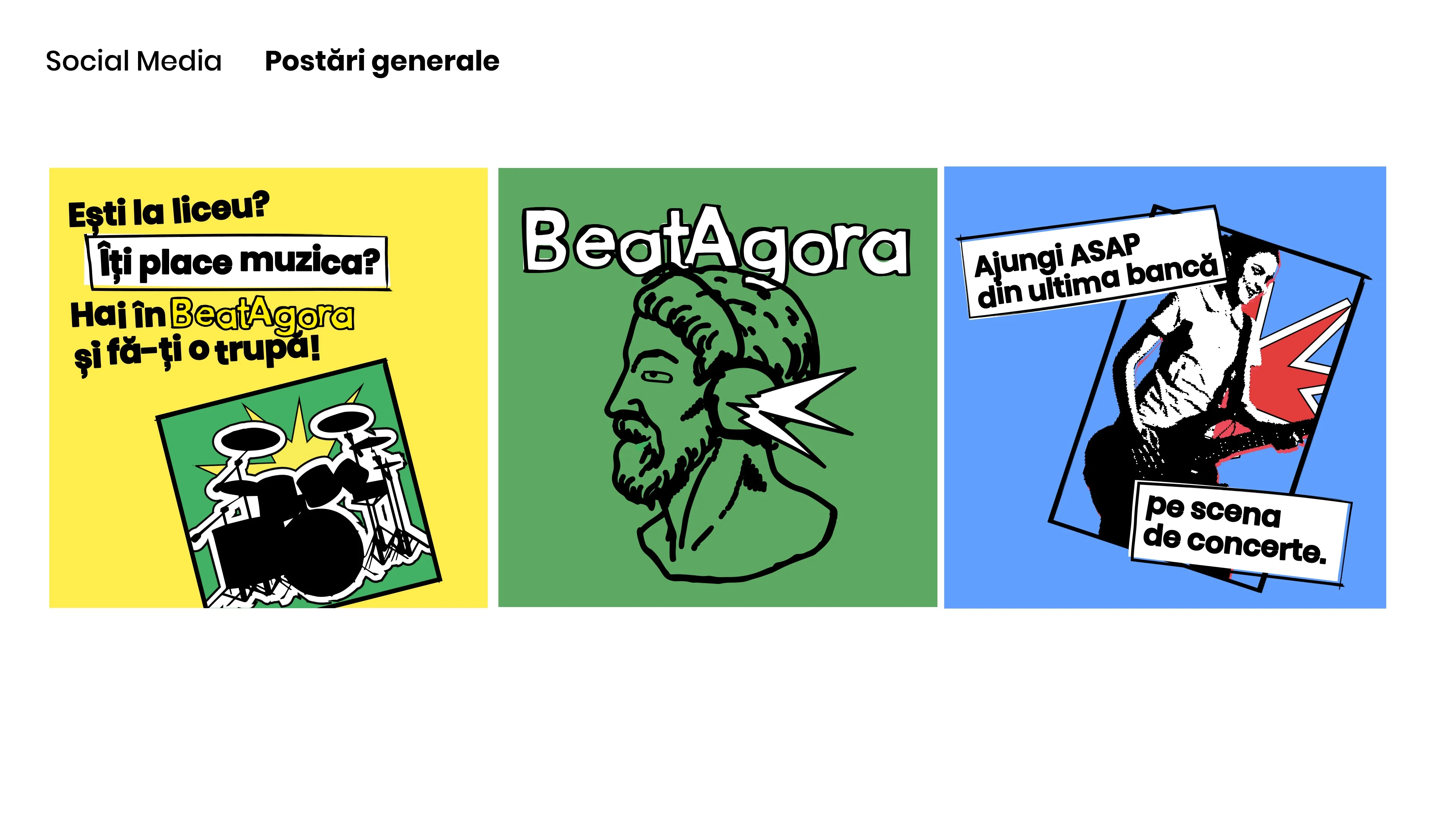
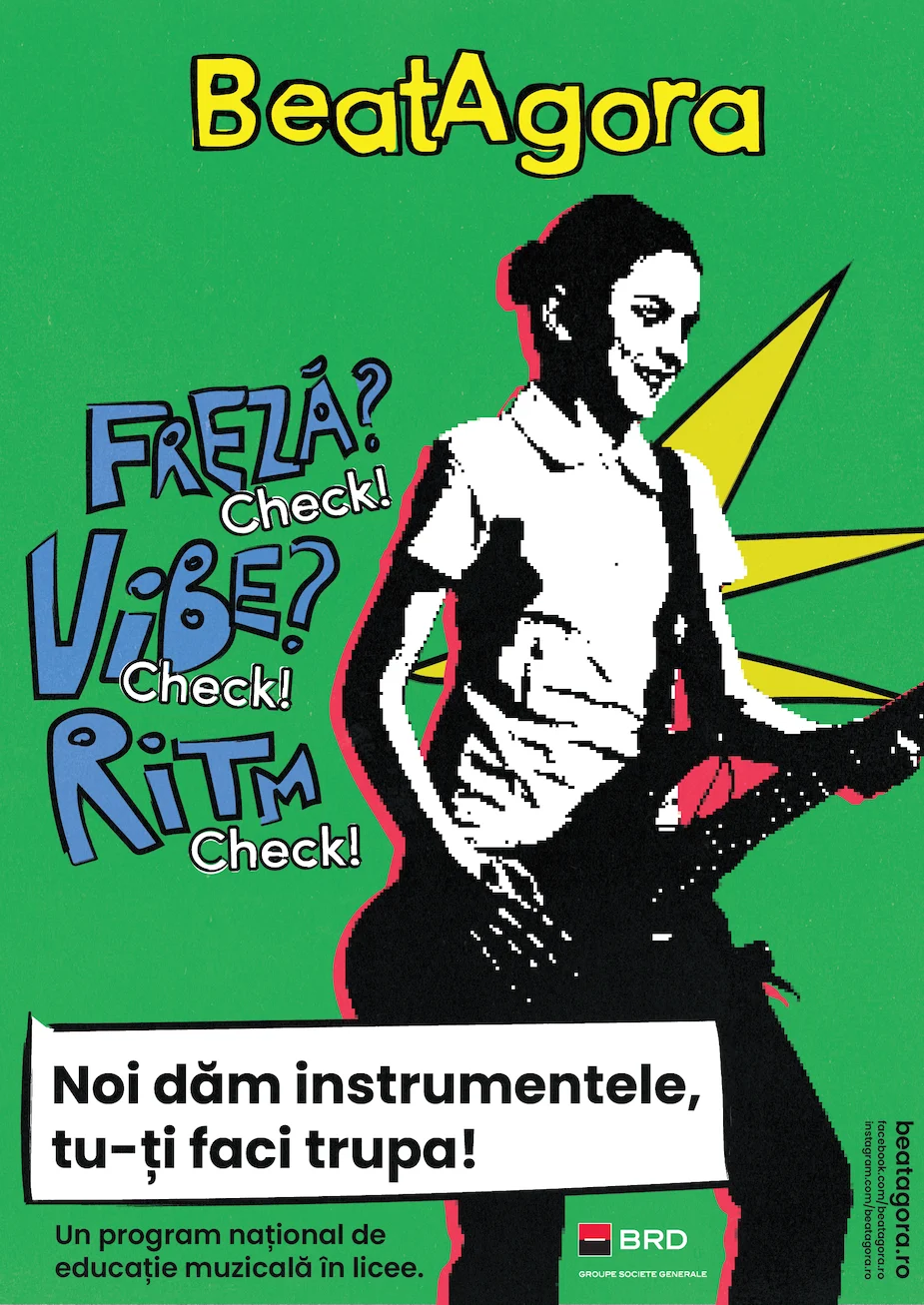
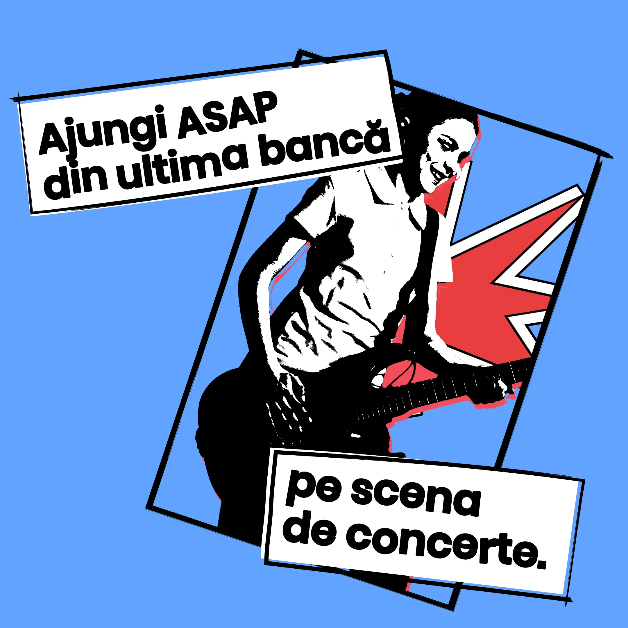
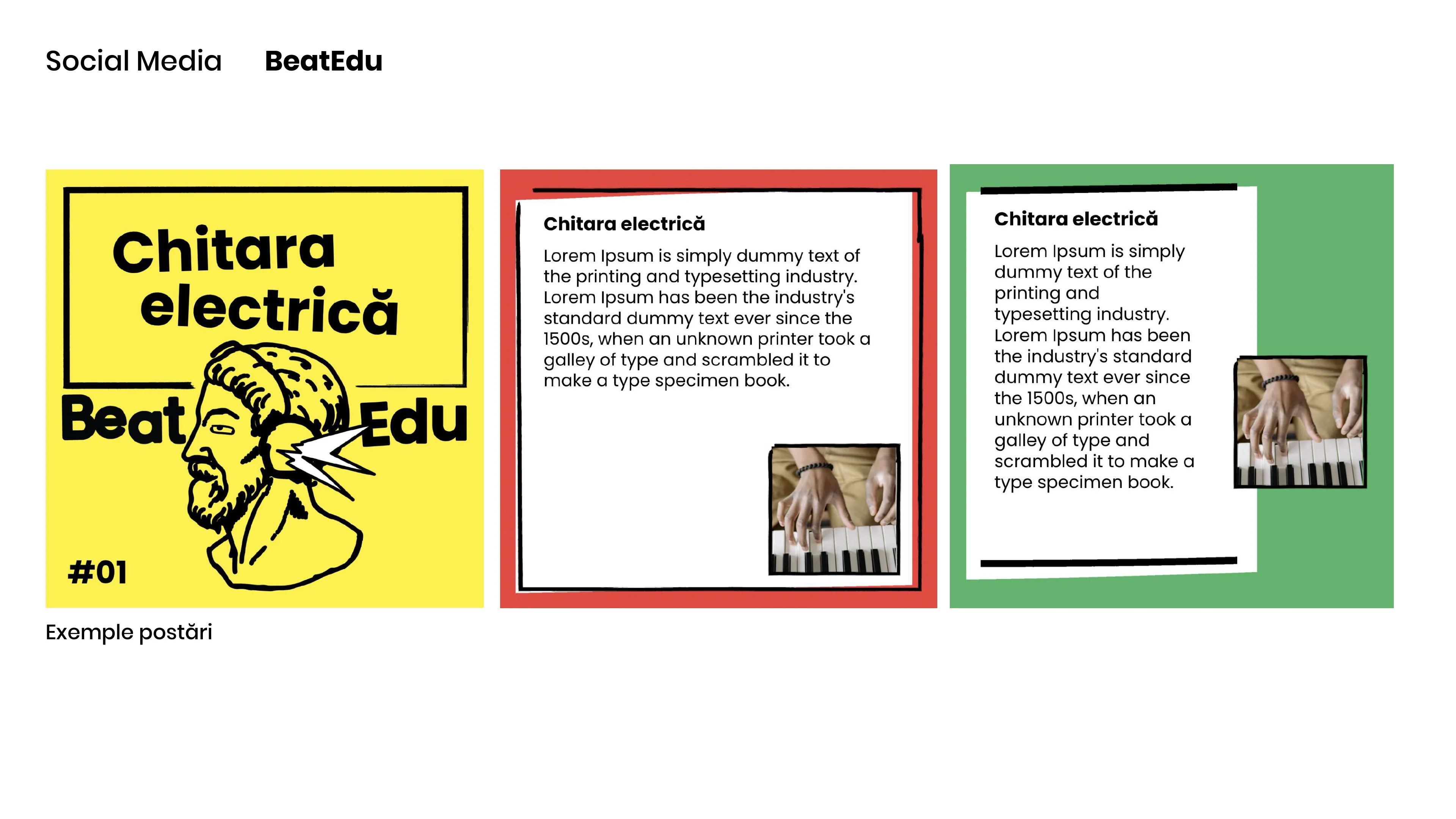
Its identity had to support that active role. The invitation is to rehearse, play together and develop a musical voice. Our visual language combines illustrated instruments, expressive lettering and high-contrast photographs with bursts of colour. It extends across recruitment posters, concert announcements, educational content and merchandise.
A recruitment poster introduces a possibility. A concert announcement gives the work an audience. Learning materials keep the programme recognisable between those moments. Giving each of these a shared visual language helps connect the first invitation with the experience of taking part.
For educational programmes, that continuity matters: the identity accompanies what participants do and gives their activity a visible presence in school and beyond it.


Cai Verzi: turning an invitation into a route
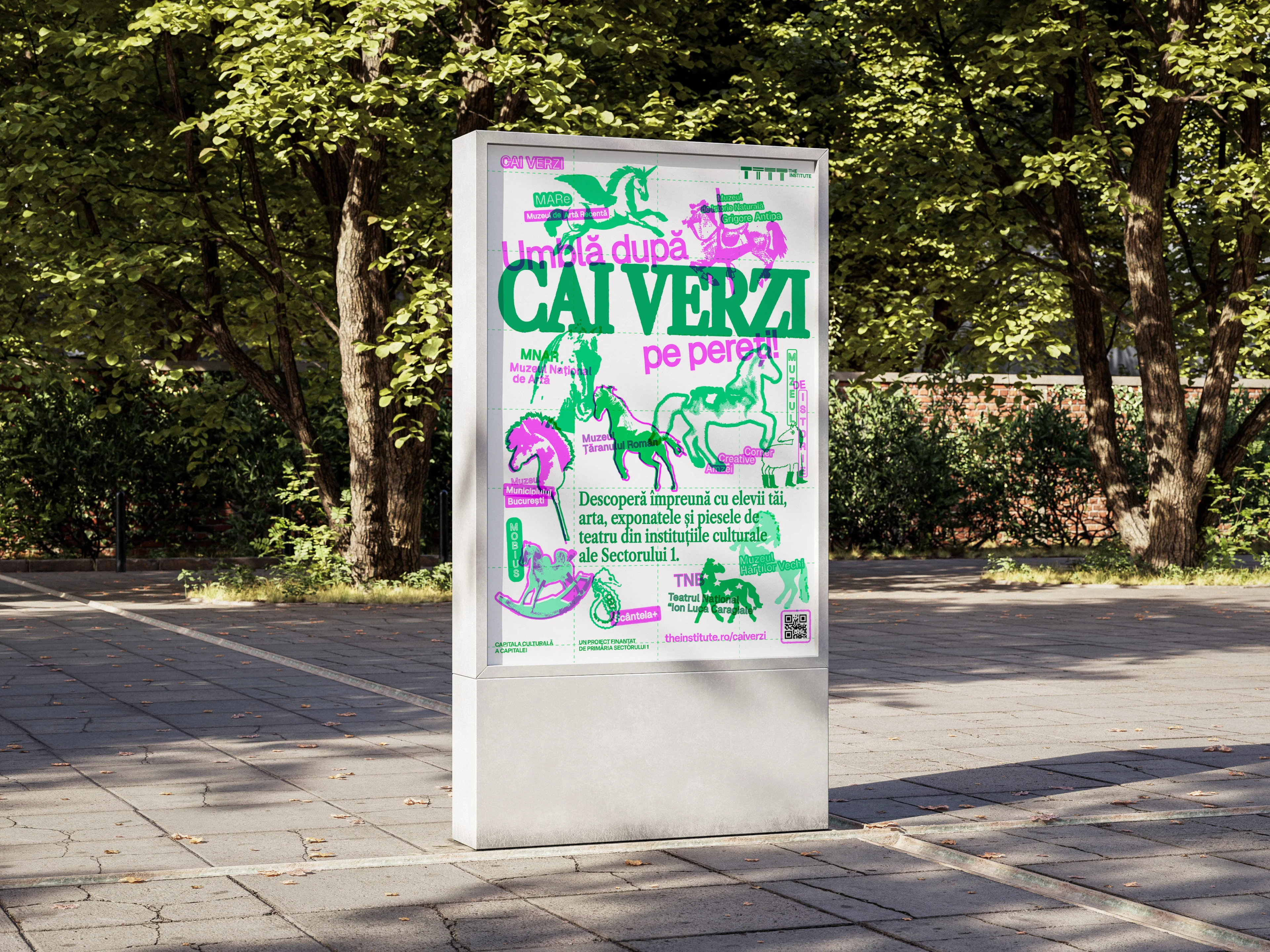
“Umblă după CAI VERZI pe pereți!”
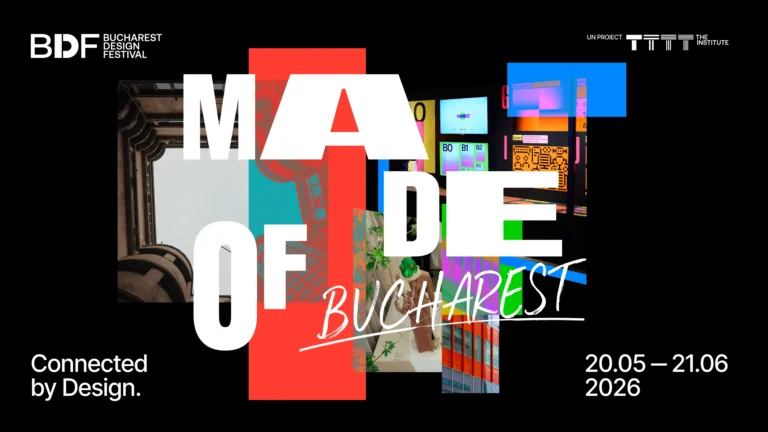
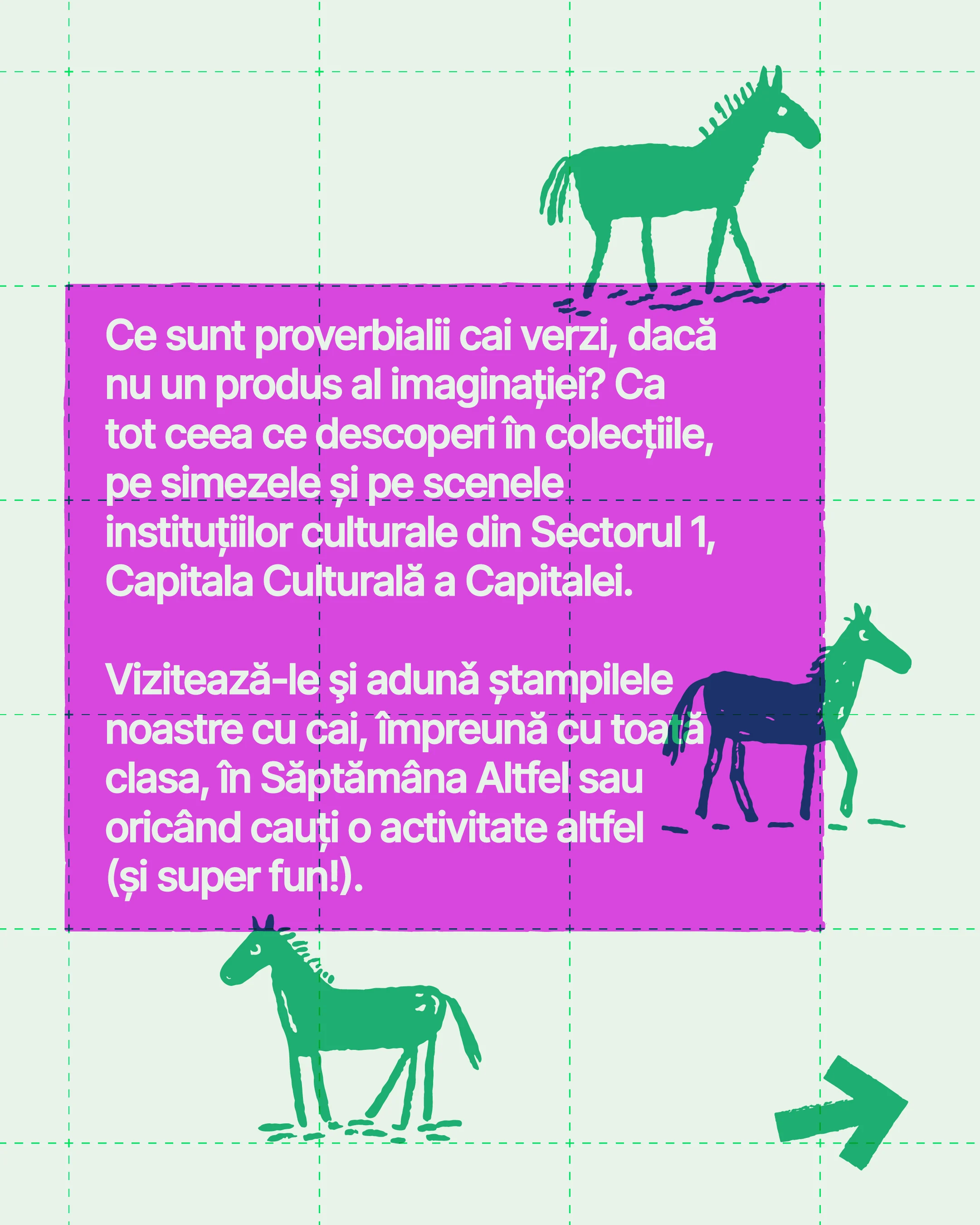
For The Institute’s Cai Verzi, we worked on naming, brand design and communications. The Romanian expression about chasing green horses on walls became an invitation to find them in the city’s cultural spaces. Green and magenta horses in different visual styles introduce museums, galleries and theatres as places to explore.
The campaign carries the idea through to practical tools. An illustrated map connects the destinations. A cultural passport gives participants somewhere to collect stamps and keep notes. The same playful voice introduces institutions and explains how to join in, helping a broad invitation become a route people can follow.
The Institute reports that the programme involved more than 2,400 pupils and students from 11 educational institutions, alongside 12 cultural institutions. Our contribution was a shared identity and tools for discovery across this collaboration. Read The Institute’s project recap.
Cai Verzi was also selected for And Now East in Sofia, an exhibition in the European Design Festival 2026 programme.



Școala9: giving education a public voice
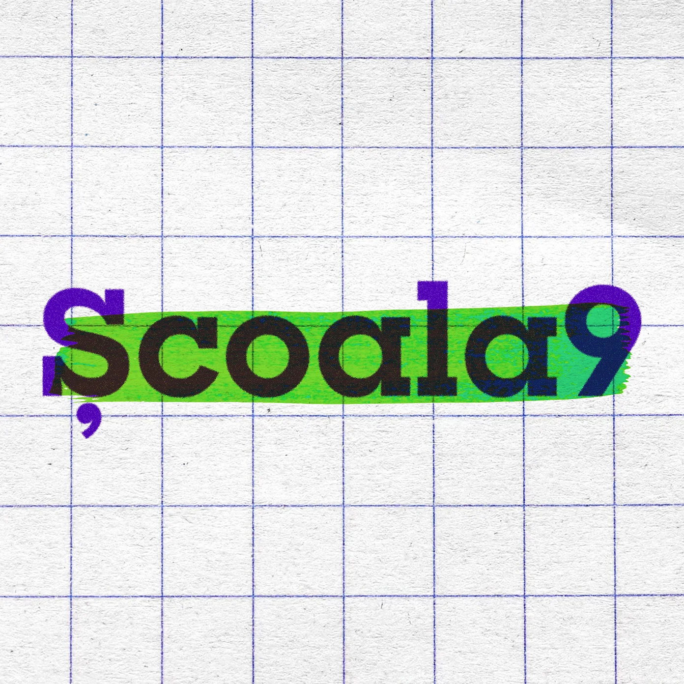
Școala9 follows education through journalism. Its stories need a recognisable home, with room for different subjects, people and perspectives.
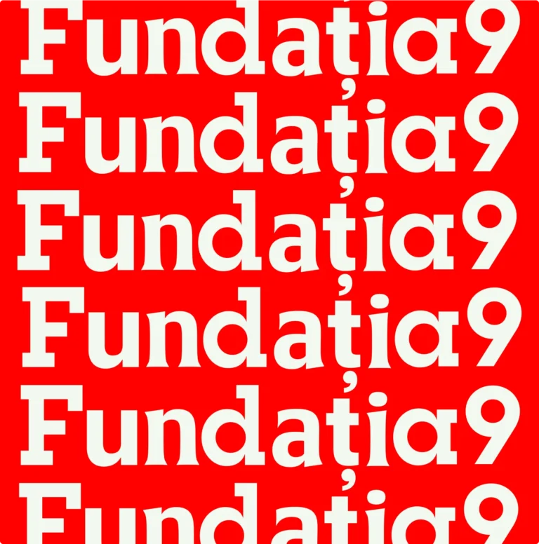
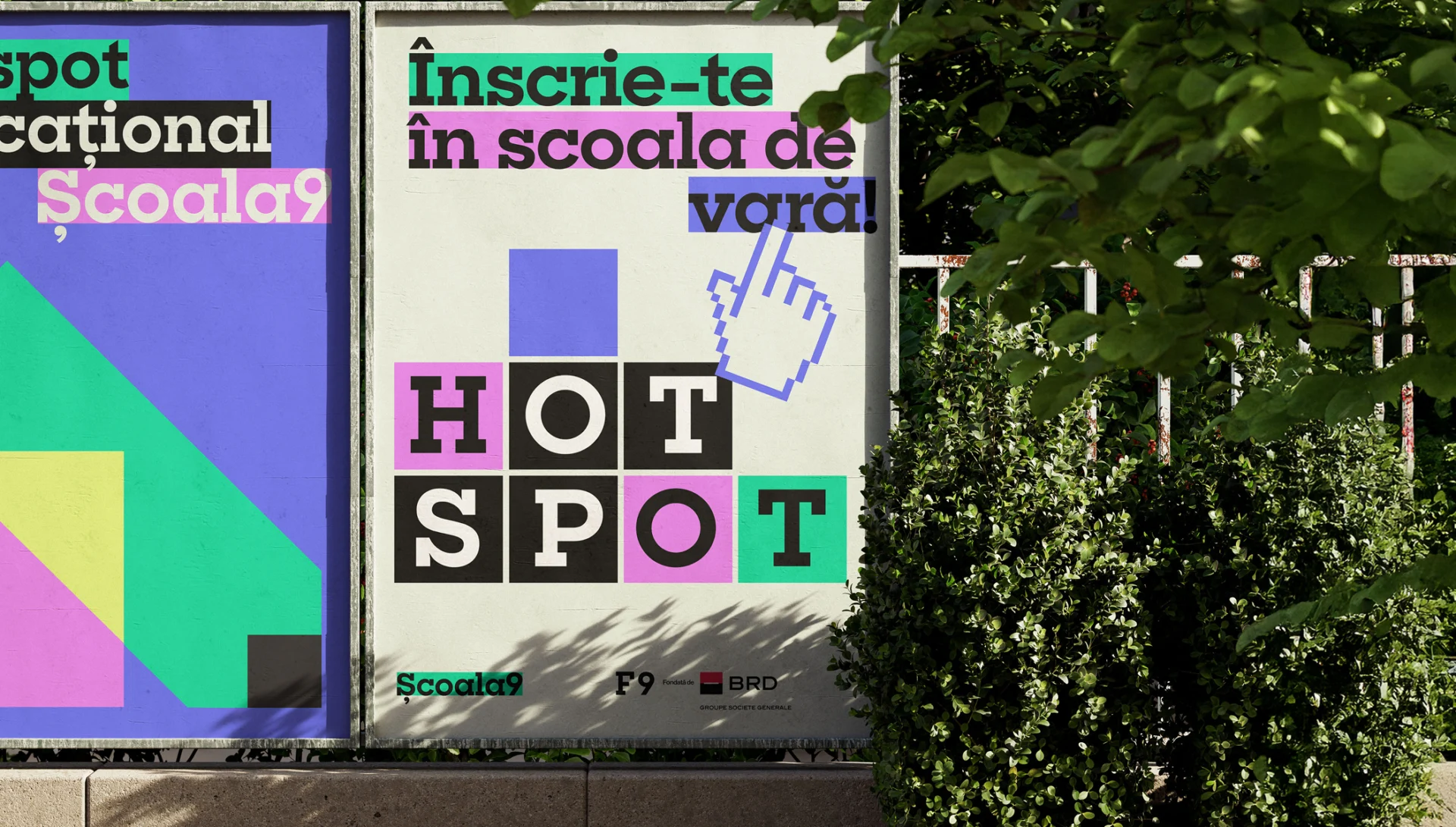
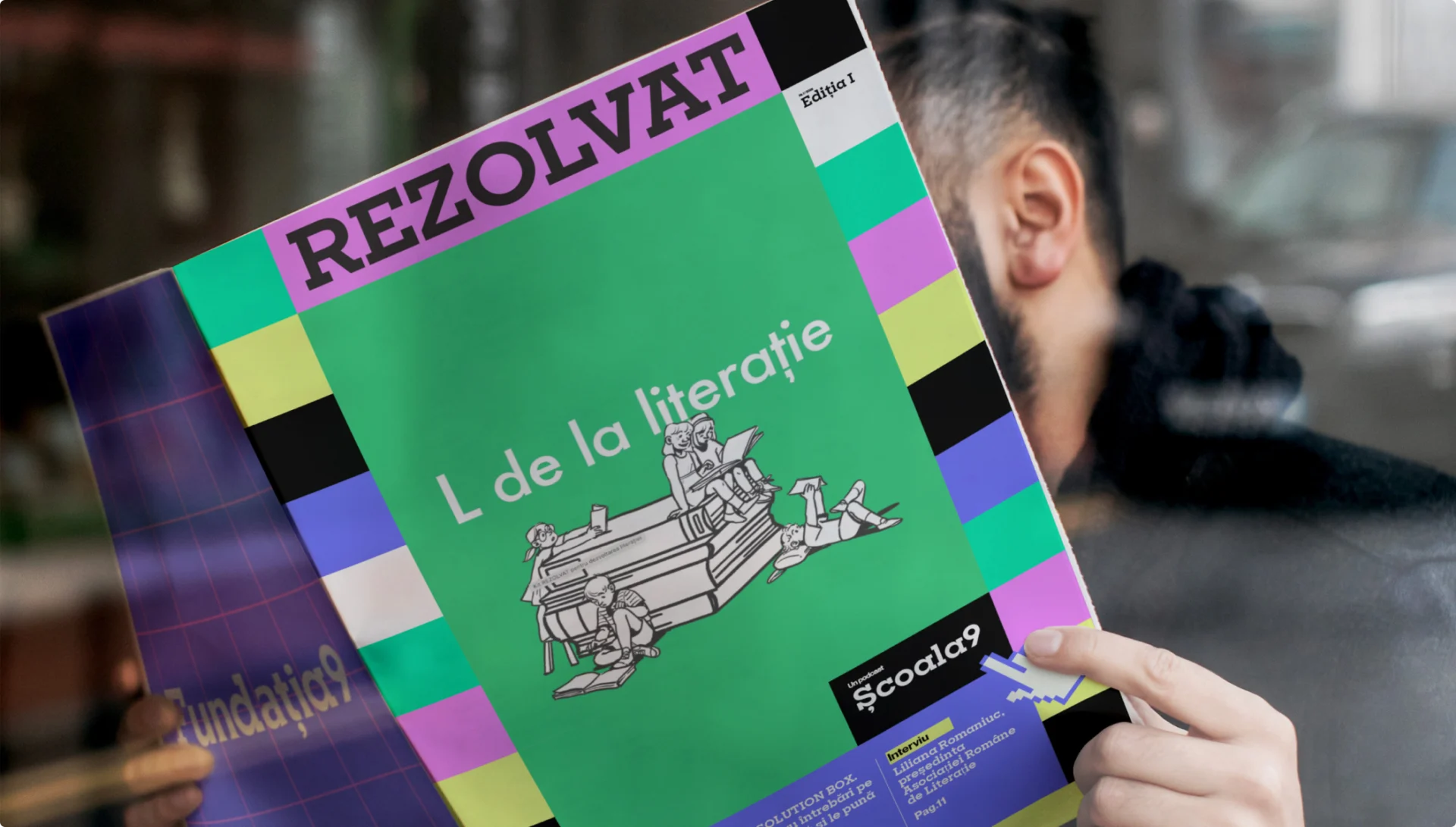
As part of our rebrand for the Fundația9 family, we gave Școala9 a language of building blocks, highlighted areas and colour. The shared number 9 connects it to the foundation and its other programmes. Its own graphic vocabulary gives education journalism a distinct place within that family, across editorial layouts and public-facing materials.
Here, branding supports recognition: a reader encountering a new story can see who is speaking and how the platform connects to a wider cultural organisation. The system provides consistency while allowing each story to have its own emphasis.
Școala9 is part of the Fundația9 identity system recognised with a Red Dot Award for Brands & Communication Design 2026. Explore the full identity system.
Across these projects, branding and communications work at the points where people meet education: discovering an activity, deciding to participate, finding their way or returning to read. Clear language and a recognisable identity help educational organisations make those encounters easier, and carry their purpose into the materials people actually use.

Project credits
QUB: Centrul Cultural Clujean.
BeatAgora: initiated by Zoli Toth, with BRD Groupe Société Générale as founding partner.
Cai Verzi: a project by The Institute.
Școala9: part of the Fundația9 family.
Branding and communications work shown: Glitch.