
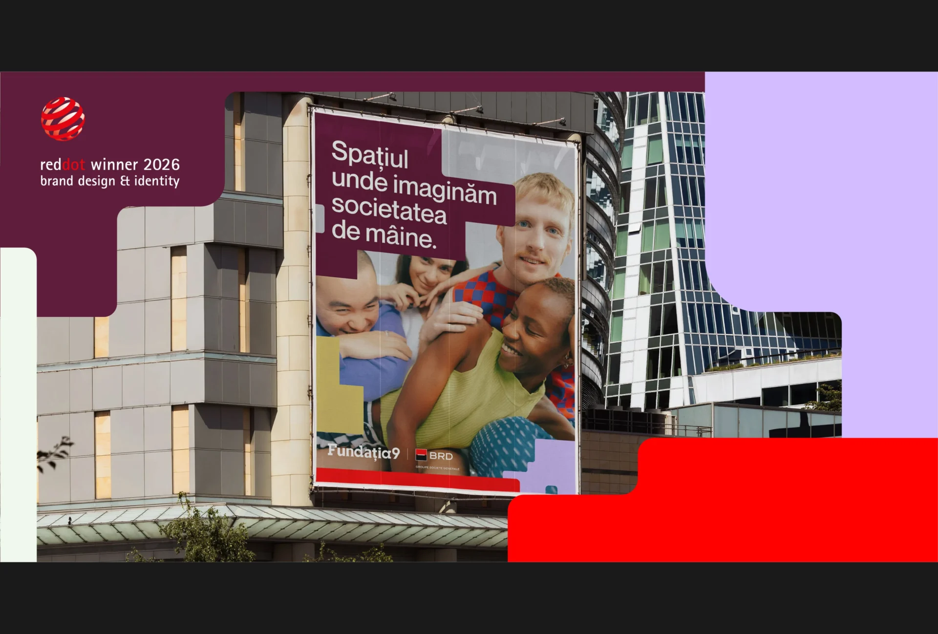
The Red Dot jury has awarded our rebrand for the Fundația9 family in Brand Design & Identity. The project connects Fundația9, Scena9, Școala9 and Rezidența9 through one cultural brand architecture while preserving four different voices.
Contents
- Why cultural brand architecture asks a harder question than a logo
- The design started with an organisational role
- How we built family resemblance without forced sameness
- One system, four interpretations of space
- Why combination offers the real test
- Five principles for cultural brand architecture
- What the Red Dot Award recognises
Why cultural brand architecture asks a harder question than a logo
The Fundația9 project began with one question: how can an identity hold four independently minded cultural platforms together without flattening what makes each one distinct?
Fundația9 is the parent brand behind Scena9, Școala9 and Rezidența9. BRD Groupe Société Générale initiated and funds the foundation. Together, the four organisations work across cultural journalism, education, artistic production, exhibitions and public programmes.
Each platform had developed its own audience, history and visual language. Scena9 had built recognition through its annual print journal and cultural journalism platform. Școala9 spoke to teachers, students and people interested in education. Rezidența9 operated from a physical cultural house. Fundația9 needed to support all three and make its own role clear.
Before the rebrand, the identities shared the number 9 in their names, but little visual structure beyond it. Different typefaces and graphic devices made joint communication harder. A poster featuring two programmes could look like a partnership between unrelated organisations. The parent brand struggled to show how the family worked.
A logo redesign could not resolve that problem. We needed to define the relationships first, then build a visual identity system around them. Our longer Fundația9 brand architecture case study documents the full project.
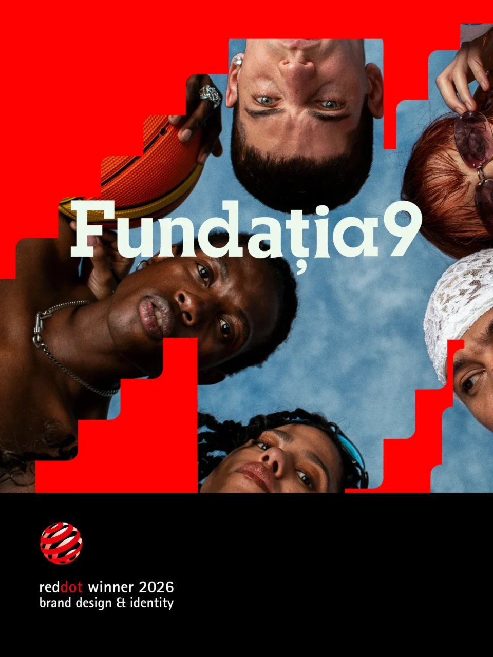
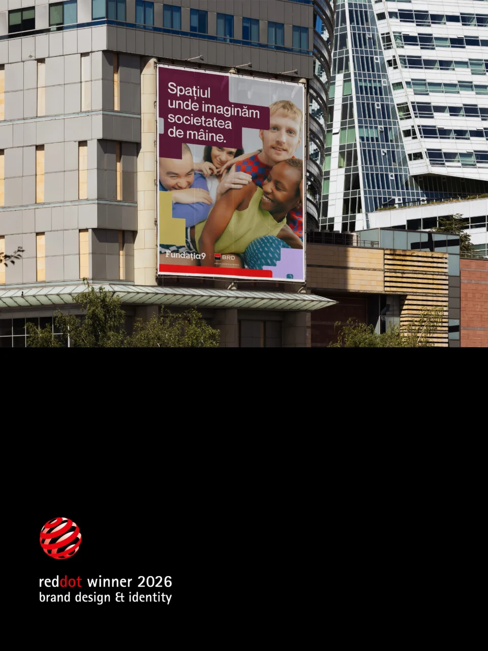
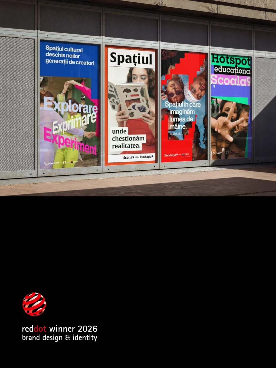
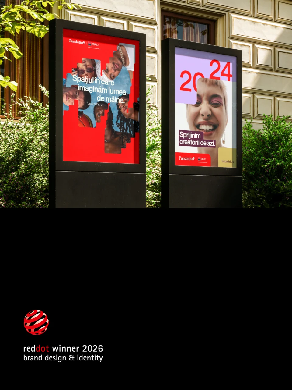
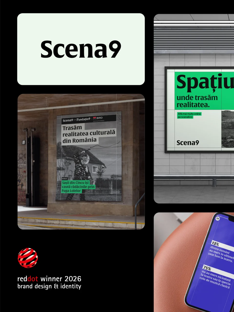
Swipe or scroll left and right.
The design started with an organisational role
We began by defining what the parent brand should do.
Fundația9 could have acted as a dominant umbrella, placing one visual language over every programme. That approach would have damaged the independence that gave the three platforms their value. We gave the masterbrand a quieter and more useful role: it gathers, aligns and creates room.
The strategy describes Fundația9 as the organisation that handles the “logistics of possibility”. It supports cultural work while allowing each programme to speak in its own register. The shared platform rests on courage, experimentation, social responsibility, trust and quality. Those ideas needed to govern the system rather than decorate it.
This role changed our design criteria. The parent identity needed enough presence to create recognition across the family. It also needed enough restraint to support editorial, educational and spatial identities with different rhythms. We designed Fundația9 as a stable layer and treated the sub-brands as distinct expressions inside it.
How we built family resemblance without forced sameness
Brand families often pursue consistency through repetition. They use one typeface, one colour palette and one compositional template across every sub-brand. That creates order, but it can also erase the character of the organisations inside the system.
We looked for coherence in structure instead.
The number 9 became the constant
The number 9 appears in the same typeface across all four logos. It acts as the visible family signature, the element that stays fixed while the names and graphic languages change. A viewer can recognise the relationship without mistaking one platform for another.
The masterbrand wordmark carries the family inside it
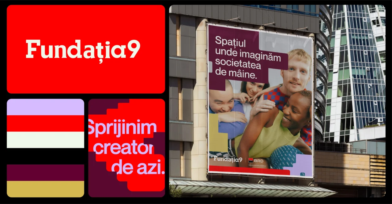
The Fundația9 wordmark brings together the typefaces associated with the three programmes. Neue Montreal, Alverata and Sharp Slab give the parent mark traces of the identities it supports. The result works like a typographic composite rather than a neutral corporate stamp.
For communication, the masterbrand uses that typographic range with restraint. It behaves as a conductor, setting alignment and tempo while leaving each sub-brand room to perform.
The grid governs combination
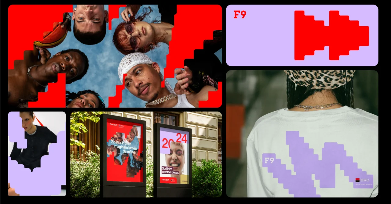
A flexible grid gives the identities shared rules for alignment, scale and co-branding. The F9 icon forms the basic unit. It can work like a cursor, a brush stroke or the edge of a space, drawing shapes that expand and contract across formats.
This structure connects campaign layouts, digital platforms, event materials and collaborations. It also gives designers a repeatable method instead of a library of fixed templates.
One system, four interpretations of space
Space became the conceptual thread connecting the family. Each platform interprets space according to the work it does: social space, editorial space, learning space and physical space.
Fundația9 creates room for culture
Fundația9 uses a fluid, permeable grid. The F9 icon defines the edges of a composition, then opens them. The system can create a field for photography, frame a statement or build a new symbol.
Its language reflects the parent brand’s role. Fundația9 makes cultural work possible, reveals connections and leaves room for future programmes. The identity can grow without forcing a new platform to imitate the existing three.
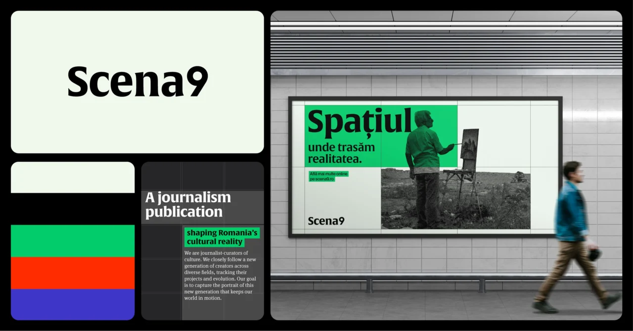
Scena9 turns the editorial grid into identity
Scena9 investigates and interprets contemporary culture. We took the grid that usually hides behind editorial design and pulled it into view. Columns, gutters, baselines and empty squares organise information with the same clarity that good journalism brings to a complicated subject.
Generous white space and sober typography support long-form reading. Strong colour blocks and highlighted elements act as editorial signals, guiding attention without disguising the content. The identity makes structure visible because Scena9’s work makes cultural reality legible.
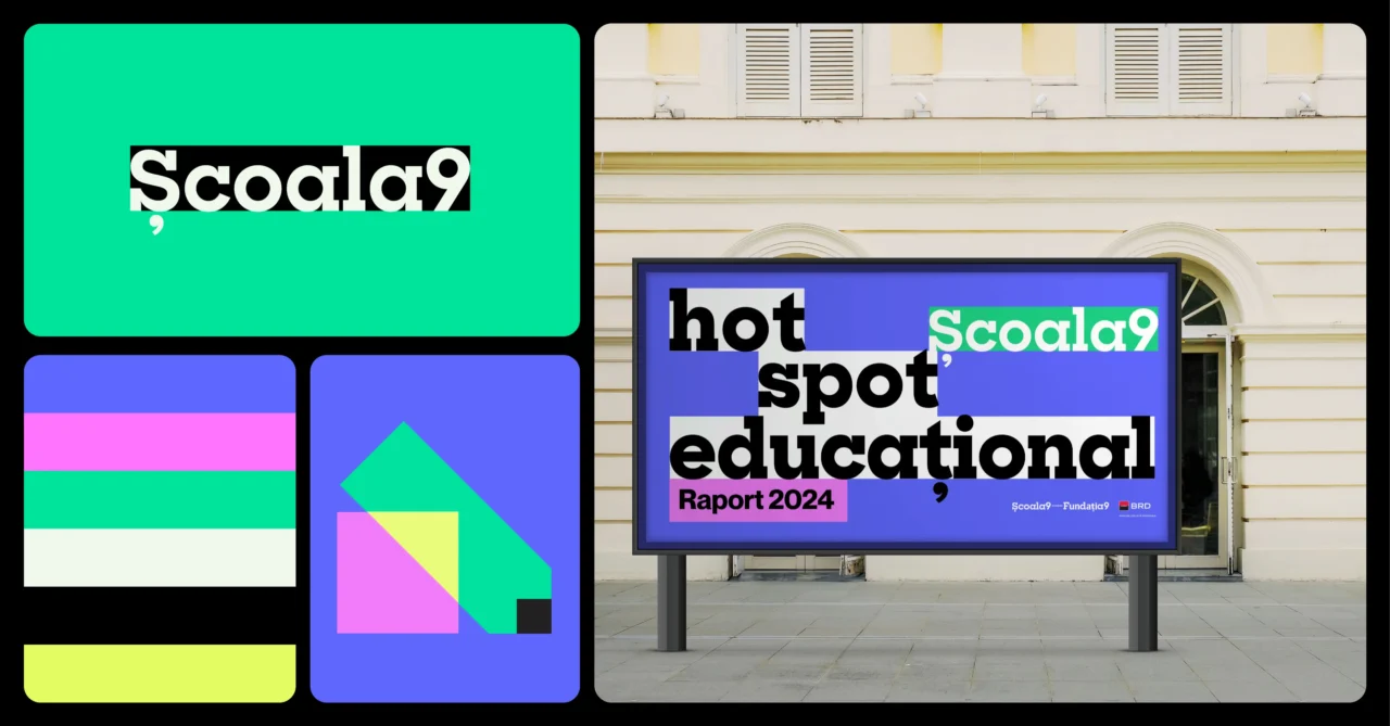
Școala9 builds knowledge from modular parts
Școala9 uses highlighting as its main gesture. Semi-transparent squares underline words, overlap images and form illustrations. The basic Ș9 unit becomes a building block, like a square in a schoolyard, a sports-ground grid or a mathematics notebook.
The visual language feels constructive, bright and open. It can explain, organise and invite participation without adopting the usual visual shorthand of education. The system gives Școala9 its own energy while preserving the shared family logic.
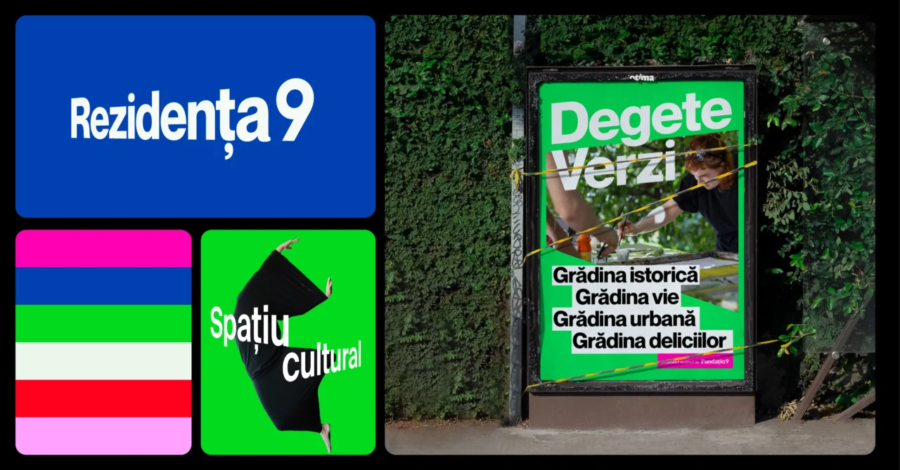
Rezidența9 gives the system physical depth
Rezidența9 connects cultural programming to a real house. We used perspective, extrusion and bold typography to evoke volume. Project names and key messages occupy three-dimensional space rather than sitting flat on a page.
That choice roots the identity in the experience of entering a cultural venue. Rezidența9 feels architectural and dynamic, with a visual language that can move between exhibitions, outdoor communication, social content and printed programmes.
Why combination offers the real test
Design presentations often show logos alone, centred on empty backgrounds. Cultural organisations rarely work alone. They communicate with funders, artists, schools, museums, publishers, media partners, venues and public institutions. Their identities meet on posters, reports, event signage, websites and campaign assets.
We treated those combinations as a primary design condition. The system had to answer practical questions:
- What happens when Fundația9 and one programme share equal prominence?
- How do all four identities appear on one campaign without creating noise?
- Where does a partner logo sit?
- Which elements remain fixed when formats and audiences change?
- How can a future programme enter the family?
The co-branding architecture provides one alignment logic for those situations. It creates recognition through position, proportion and the constant 9. Each identity keeps its own typography, colour and spatial behaviour.
This distinction separates a functioning brand architecture from a collection of redesigned logos. The system earns its value when multiple organisations need to act together.
Five principles for cultural brand architecture
The Fundația9 rebrand offers five practical lessons for foundations, museums, festivals and cultural networks managing several programmes.
1. Define the relationship before designing the marks
Write down what the parent brand controls, what it enables and where each programme retains independence. Visual decisions become easier once the organisation can describe those roles without design language.
2. Choose a small number of constants
A family does not need to share everything. One recognisable constant can carry the relationship if the system applies it with discipline. For Fundația9, the number 9 performs that role.
3. Put coherence into structure
Shared grids, alignment rules and co-branding principles survive more contexts than a fixed template. They help internal teams and external partners produce new work without copying one approved layout.
4. Design the combinations early
Test the difficult applications before polishing isolated logos. Put three programmes, a funder and two partners on the same poster. Build a mobile header. Try a campaign with photography and another with typography. The collisions reveal what the architecture still needs.
5. Leave a clear route for growth
Cultural organisations change. They launch programmes, close formats and form new alliances. A useful identity system explains how something new can join, which elements it inherits and where it can differ.
These principles make branding for cultural organisations less dependent on visual uniformity. They give each institution a system it can use, teach and extend.
What the Red Dot Award recognises
The Red Dot Award: Brands & Communication Design honours brands and communication projects for design quality and creative achievement. Its international jury examines each entry individually over several days.
The jury awarded the Fundația9 rebrand a Red Dot in Brand Design & Identity for 2026. The recognition belongs to the complete cultural brand architecture: the parent identity, the three programme identities and the system that allows them to work together.
The project has moved from brand guidelines into campaigns, publications, digital products and public space. That use matters because the identity was designed as working infrastructure. The IQads interview with our design team goes further into the craft and thinking behind the project.
Graphic design:
Andrei Nicolescu, Ana Maria
Dudu
Brand strategy:
Simina Leotescu, Sonia Panait
Project management:
Domnica Stuparu
Creative direction:
Dan Stănescu
The Fundația9 and BRD teams gave the system room to evolve across four organisations and many forms of cultural work. The award marks one point in that process. The identities will keep proving themselves through the programmes, collaborations and public encounters they support.
Glitch is a Bucharest-based creative studio working across culture, social impact and institutions. Explore our branding and communication work, visit the public Glitch Library or see our profile at Romanian Design Week.